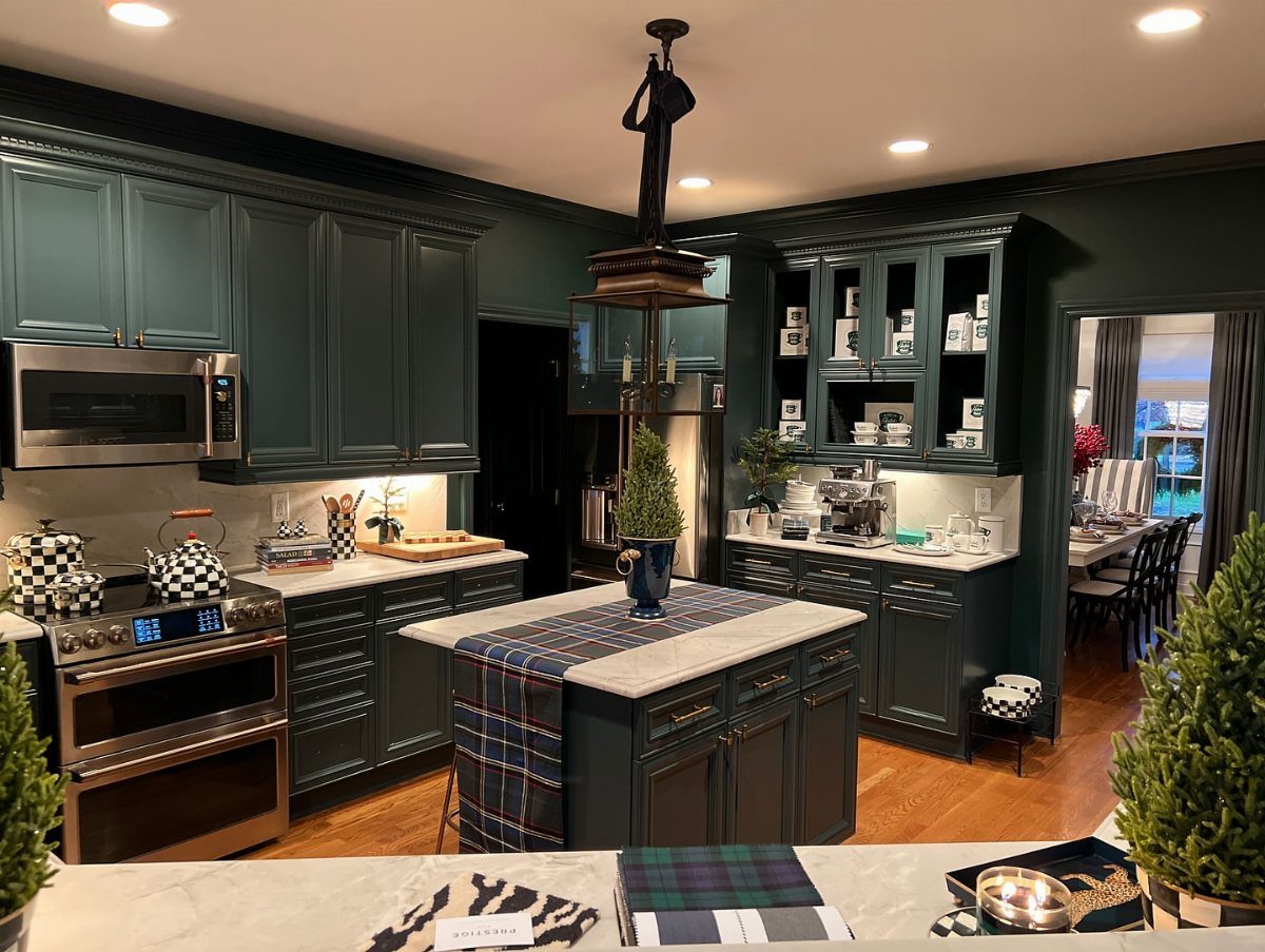
These ideas run from a quick brass pull swap to a full checkered tile floor, and the one that belongs in your kitchen depends on whether you are dressing what you have or building around what you cannot change.
A sage green island with leather stools demands the right room proportions; a rail of copper cookware only needs one solid stud and the wall you already own.
The detail that keeps this list honest is tin-lined copper, not lacquered showroom stock, because unlined metal reacts with tomatoes and that distinction is what separates a working kitchen from a styled photograph.
1. Copper Cookware
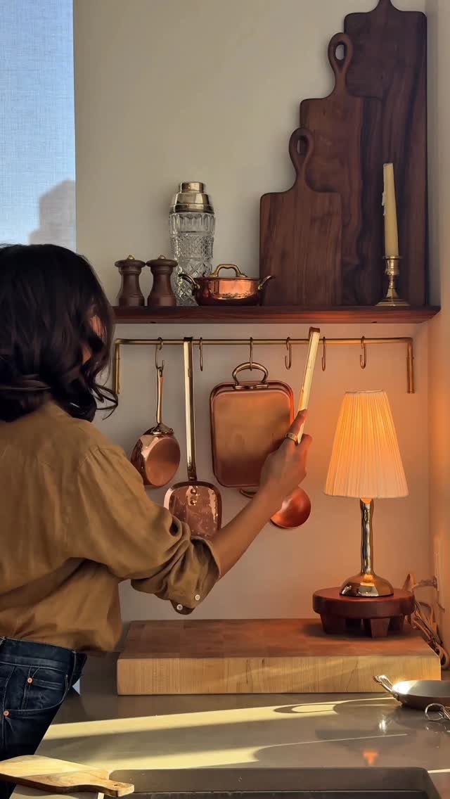
Copper cookware hung on a rail turns storage into the room’s best feature.
The warm tone reads richer than stainless steel and ages into a deeper patina that still looks intentional. I would check the wall structure first: a brass rail with several pots needs real support, not drywall anchors.
A stud or solid backing matters more here than with a lighter utensil bar. The pieces you actually cook with should hang within reach; anything purely decorative belongs higher up where it won’t block workflow.
I skip the lacquered showroom copper and buy pans with a tin or stainless lining, since unlined copper reacts with acidic foods.
2. Brass or Aged Bronze Accents
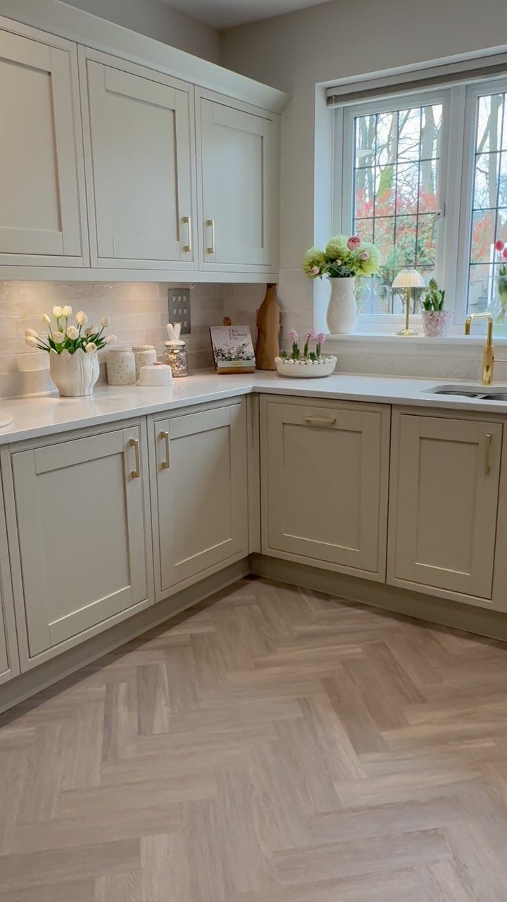
Brass handles and a matching faucet warm up shaker cabinets without changing the cabinet boxes themselves. The visible hardware sits at a mid-tone, not bright gold, which keeps the look grounded in something older than the install date.
I would order one sample pull before committing to the full count; brass varies enormously by supplier, from pale champagne to almost brown.
The faucet matters most because it gets handled daily, so I spend the difference there and save on the smaller knobs if the budget tightens.
Aged bronze reads nearly the same in some lights and costs less, though it shows water spots differently.
3. Wooden Cutting Boards
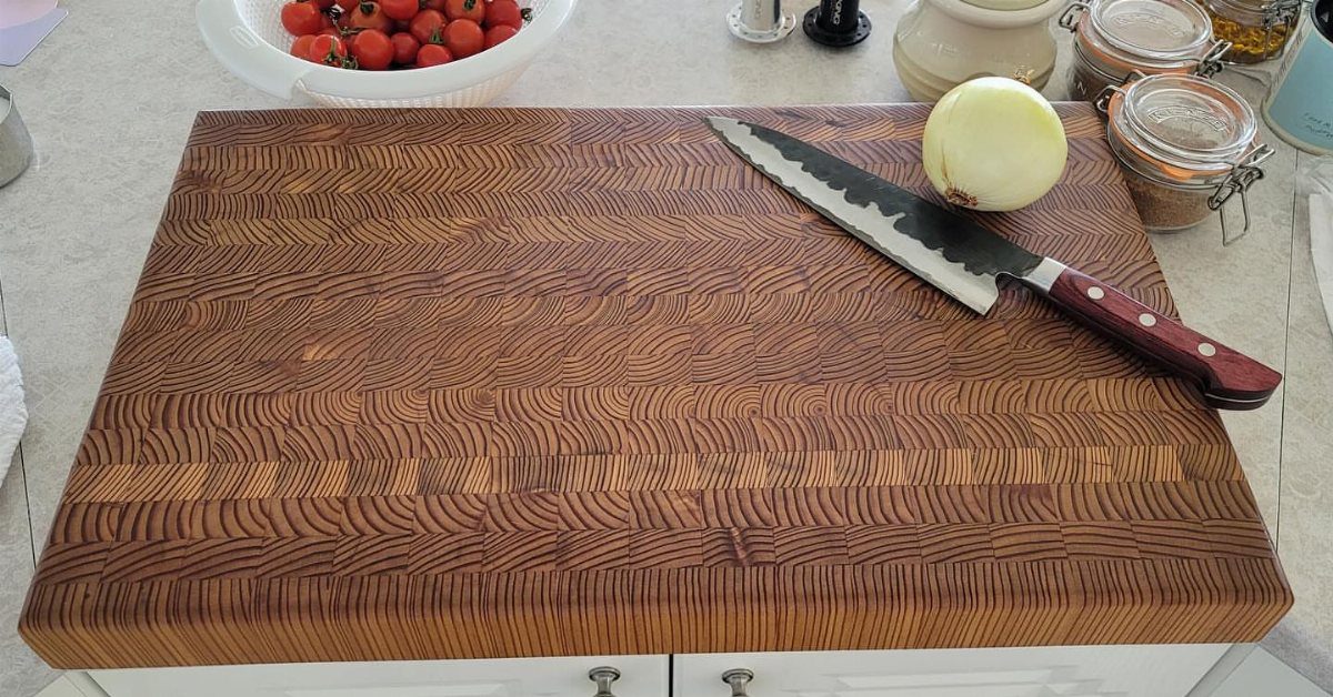
An end-grain board outlasts edge-grain by years because the knife fibers close back up between cuts. The visible block sits thick enough to stay put without sliding, which means real heft you can feel when you lift it.
I keep one board for produce and bread, another for raw meat, and I mark the meat board somehow, a corner notch or a different wood tone, so I never confuse them.
Oil it monthly with food-grade mineral oil, not olive oil, which goes rancid. I would skip any board with rubber feet; they trap moisture underneath and the board warps where you cannot see it.
4. Crystal or Cut-Glass Drinkware
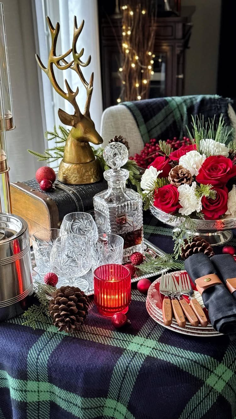
Cut-glass drinkware catches light in a way that smooth glass cannot, and the weight in hand signals something different from everyday tumblers.
The visible set sits on a tartan cloth, which is the pairing that makes it feel Ralph Lauren rather than just inherited.
I would start with a decanter and two glasses rather than a full dozen; the look comes across in a small grouping, and full sets sit unused in most cabinets.
Hand washing preserves the cutting, though modern dishwashers with gentle cycles work if the temperature stays moderate. I skip anything too ornate; the simpler patterns mix better and read less like a formal occasion only.
5. Tailored Cabinetry
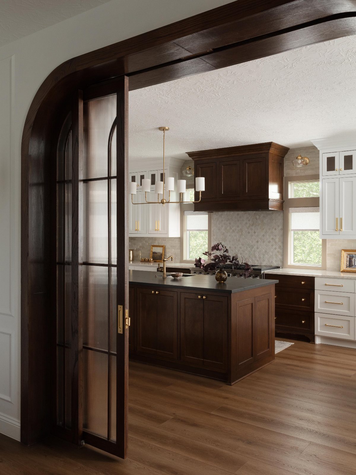
Dark wood framing white cabinet boxes creates the tailored look without building every door from solid hardwood. The visible archway frames it like a room that was always there, which is the effect I would aim for: built-in, not bought-in.
I would check the existing door heights before ordering; the proportion of dark to light only works when the frames align with the architecture already in place.
The hardware sits small and brass, not oversized, because the wood itself carries enough presence. This look needs a kitchen with some square footage; in a galley, the dark wood closes the walls in too far.
6. Create a Collected Kitchen
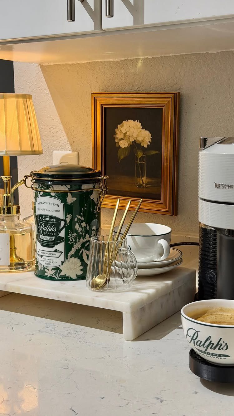
A coffee station collects objects that share a mood rather than a set, which is how personal kitchens avoid catalog sameness.
The visible pieces, a green canister, a small lamp, a framed print, each stand alone but share scale and a muted palette. I would keep the surface spare; too many objects and cleaning becomes a chore of moving things.
The lamp is the detail most people skip, and it matters more than the canister because it changes how the corner feels in early morning light.
I wire any station lamp to a switch, not a cord I have to reach behind equipment to find.
7. Ralph Lauren Bear Dishware
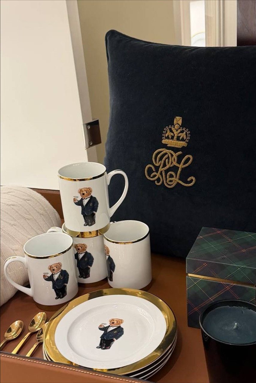
The Polo Bear mugs and plates carry the same gold rims you’d see on older hotel china, which keeps them from reading as novelty items.
I would use them as the accent layer, not the full set; two mugs and a pair of salad plates do more than a service for twelve.
The navy and plaid pieces nearby, the velvet pillow and the box, share the same deep tones and make the collection feel intentional rather than scattered.
I skip mixing the bear with other character dishes; the pattern needs restraint to stay adult. Hand washing protects the gold, though the ceramic itself handles a dishwasher fine.
Balancing a curated look with lived-in charm, luxury with heritage, ‘Ralph Lauren is just about as timeless as it gets,’ says interior designer Kathy Kuo.
8. Equestrian Plaid Dishware and Linens
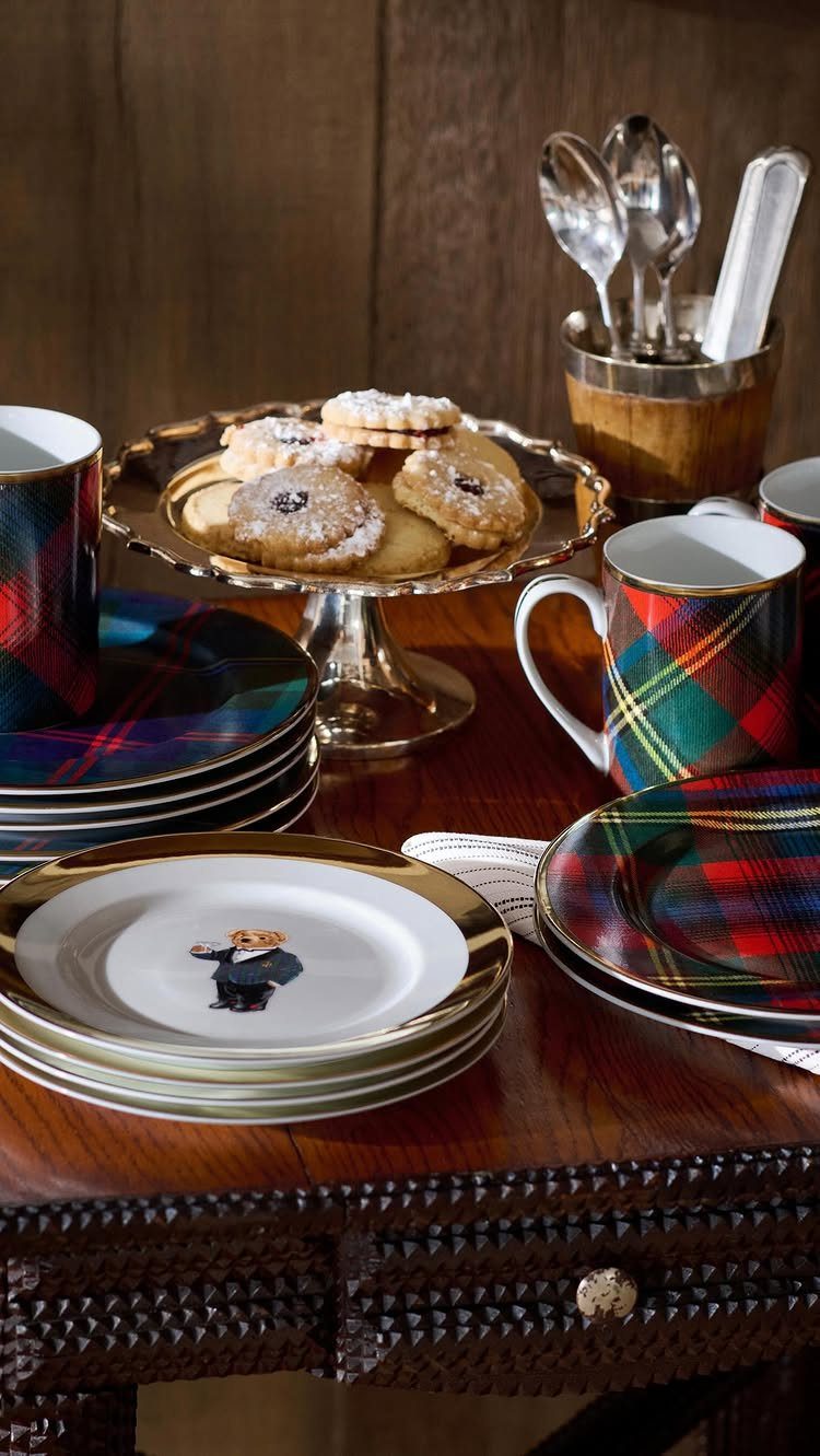
Tartan plates and mugs stack into a table setting that reads heritage without needing a full Scottish estate.
The visible pairing, plaid against a wooden tabletop with a gold stand for height, works because the materials stay warm and matte rather than glossy.
I would buy the dinner plates first and add mugs later if the pattern holds up to daily use; tartan can tire the eye faster than a solid.
The dishware shares the same palette and belongs stacked on open shelving or in a cabinet nearby, not scattered across the table where the pieces compete. I keep the silverware simple; anything ornate fights the pattern.
9. Sage Green and Leather Island
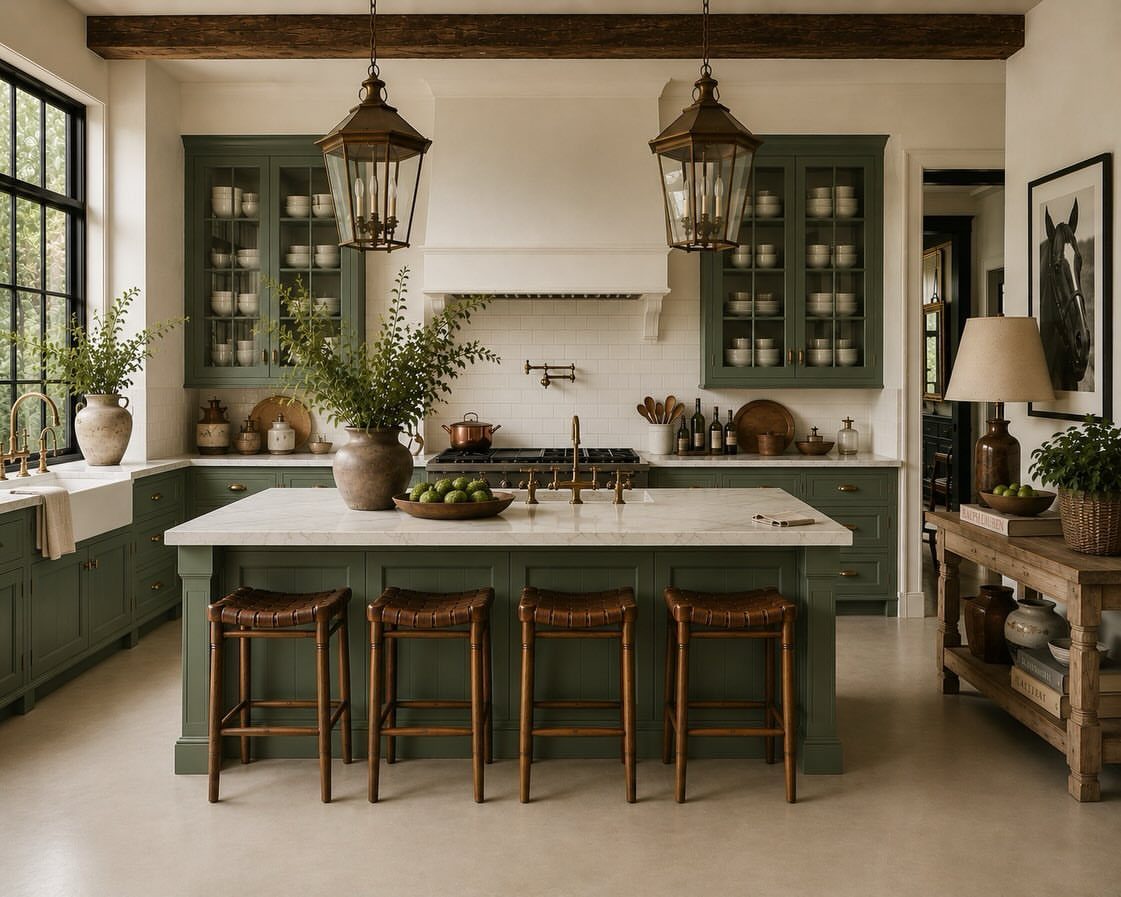
Sage green cabinets read as color without shouting, especially under wood beams that add the warmth the shade needs. The leather stools, woven rather than solid, keep the island from feeling heavy despite the marble top above them.
I would check the stool height against the counter before ordering; leather seats compress over time and a tall stool can end up sitting noticeably lower.
The brass pendants need generous head clearance or the island becomes an obstacle course. This palette suits kitchens with natural light; in a darker room, the sage turns muddy and the leather loses its texture.
10. Dark Wood and Checkered Floors
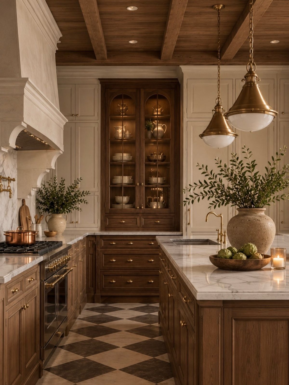
Dark wood cabinetry against a diagonal checkered floor creates the kind of contrast that photographs well and lives even better. The coffered ceiling adds the same depth overhead so the room doesn’t feel bottom-heavy.
I would lay the tile on the diagonal only if the kitchen is square or wider than it is long; in a galley, the pattern stretches the room sideways and feels disorienting.
The brass pendants and marble island repeat materials from the earlier entries, which is how a collected kitchen stays coherent. I skip the glass-front cabinet unless I own objects worth displaying; dark wood frames empty shelves worse than painted ones.
11. Brass Wire Mesh Cabinet Inserts
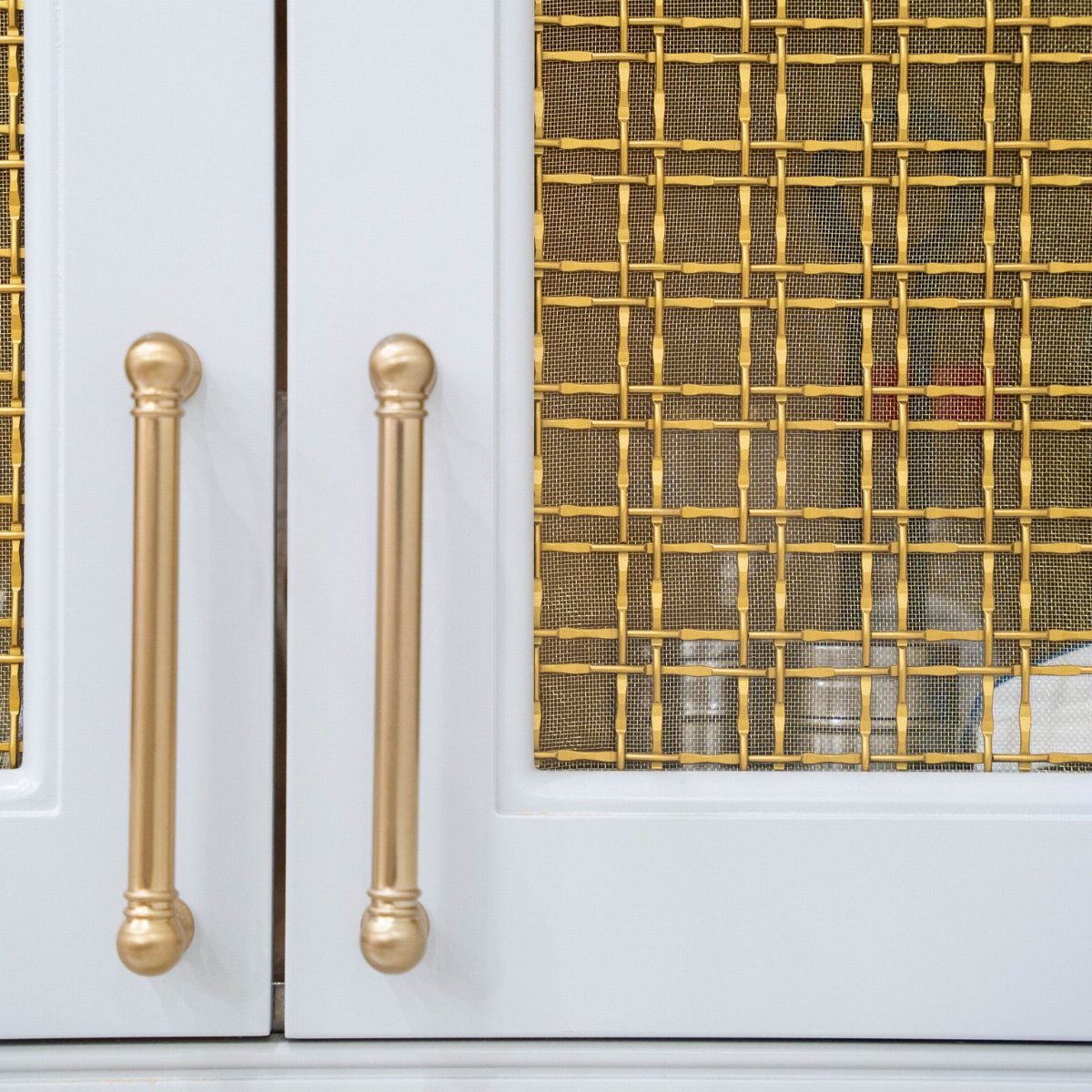
Brass wire mesh over cabinet panels filters light and hides clutter better than clear glass, which is why I prefer it for the cabinet run that faces the main living space.
The vertical pulls share the same metal and scale, and the pair of decisions, mesh plus pull, need to be made together or the hardware fights the insert.
I would order a sample panel first; mesh patterns vary from fine weave to nearly grid, and the wrong openness turns dishes behind it into a blur rather than a silhouette.
The white painted frame keeps the brass from reading as antique, which matters in a kitchen that isn’t otherwise period.
Establish the Foundation
Start with what you cannot swap out on Saturday morning: the footprint, ceiling height, window placement, and any existing woodwork or stone worth keeping.
These elements set the real limits. A strong floor or well-proportioned casing is a better anchor than a full gut job.
The island should earn its size.
In my view, an island that simply fills the gap between cabinets wastes opportunity and blocks flow. Leave enough room on all working sides for passage; add more if stools are in use.
Choose stool count by the island’s length, not by how many people you hope will sit. Three stools on a long island is tight; two leaves room to actually use the surface.
I like integrated appliances when I want the cabinetry to read as one continuous run, which fits the tailored look.
Exposed appliances are fine, but only if their finish and scale talk to the materials around them. Place them for daily function first, then check sight lines.
Flooring should relate to adjacent rooms, not restart the conversation. Wood or stone that extends from the living area carries the collected feeling through without effort.
Avoid Common Mistakes
A few heritage references set direction; too many equestrian or Americana pieces turn the kitchen into a set. Accessories come last and stay sparse.
Dark wood and deep color need balance. The list notes dark framing on white cabinet boxes, not dark everywhere.
Cream, stone, or lighter surfaces keep the room from bottoming out visually. I would decide which one or two materials deserve attention and keep the rest quiet.
Hardware selected alone rarely works. The brass mesh entry makes this plain: mesh pattern and pull scale must be chosen together or they fight.
I extend that to every metal finish in the room. Faucet, pulls, pendants, and any visible appliance trim should share a relationship, not a perfect match.
Circulation around the island is part of its design, not just whatever space is left over.
The checkered floor entry warns against diagonal patterns in galleys; the same logic applies to island placement. An island that fits on paper can still choke movement once people actually use it.
Refinement should not erase comfort. The bear dishware and tartan drinkware work because they are used, not displayed behind glass.
Frequently Asked Questions
How do you pronounce Ralph Lauren?
Ralph Lauren is pronounced "LAU-ren," with the stress on the first syllable and a soft "au" sound, not "Lau-REN" as many people say.
The designer’s name is one of those American fashion labels that gets mispronounced often, partly because the spelling looks like it could go either way.
I hear both versions in client conversations and usually don’t correct anyone unless we’re ordering something specific where the name matters.
What is the Ralph Lauren aesthetic?
The Ralph Lauren aesthetic blends classic Americana with British-inspired details and equestrian motifs, built around an upscale, moody palette of hunter green, navy blue, and burgundy.
Dark wood furniture with eye-catching woodworking, burnished brass, and pewter metallic accents carry the look, while the overall feeling stays cozy and warm rather than maximalist.
What makes it recognizable is that it adapts to almost any setting, from a country home to a city loft, without losing its collected, heritage-rooted character.
The kitchen version of this look relies on the same principles: substantial materials, deeper colors, and objects that feel found rather than bought all at once.
What are some good ways to decorate my kitchen?
Start with what you cannot change easily: the footprint, ceiling height, window placement, and any existing woodwork or stone worth keeping.
In a Ralph Lauren-inspired kitchen, I bring the style in through warmer materials, traditional hardware, richer colors, tailored lighting, and a few heritage details. I would not try to make the room fully traditional; that reads costume, not collected.
If your budget is tight, repainting what you have and swapping the hardware usually wins over buying cheap replacement cabinets that fight the rest of the room.