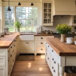
These kitchen style decor ideas run from a stack of bright bowls on the counter to a built-in banquette that needs a contractor and a serious budget.
The one that belongs in your kitchen depends on whether you rent and need to roll it out on move-out day, or own and can paint the cabinets purple with no landlord to answer to.
The best ideas here treat the room as living space, not just workspace, and the line between functional and decorative is thinner than most people assume.
1. Statement-Making Wallpaper
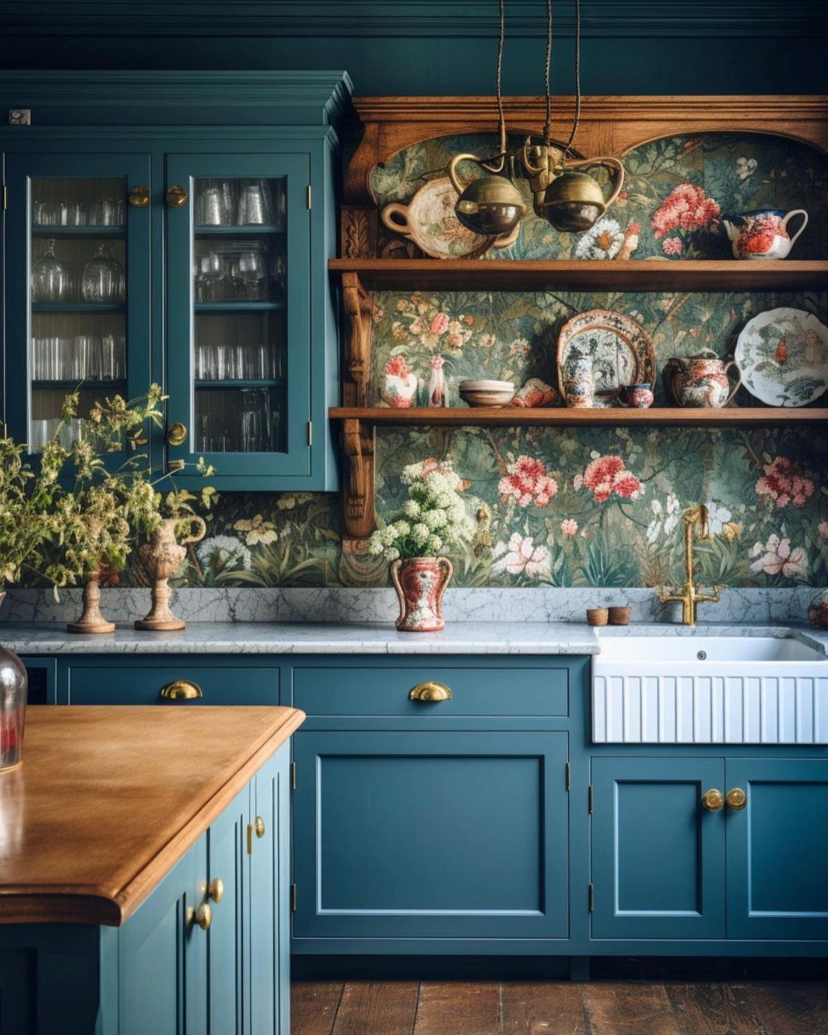
A single wall of patterned paper behind open shelving turns the kitchen into a room that feels finished rather than functional. Large-scale floral wallpaper reads vintage without getting fussy when the ground color picks up the cabinets.
What I check first is moisture.
Behind a sink or range, vinyl-coated or scrubbable paper lasts; standard paper buckles within a year. For a backsplash zone, I would order an extra roll for repairs and keep the pattern busy enough that a seam or patch disappears.
2. Wicker Stools
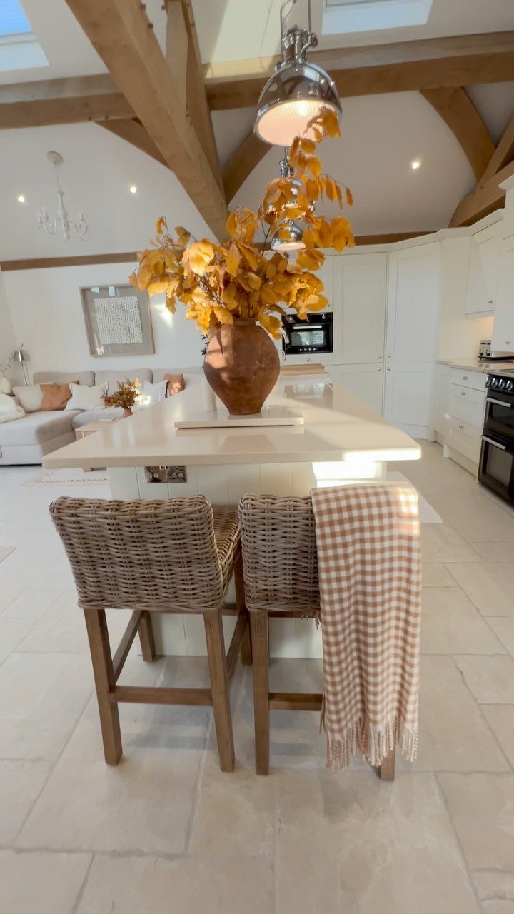
Wicker brings texture to a kitchen that can otherwise go hard and flat with tile and laminate. Wicker stools keep a kitchen warm when the legs read wood rather than metal, which pushes the look toward tropical.
Before ordering counter stools, I measure floor to counter and subtract for leg clearance; standard heights pair with standard counters without guesswork.
In a high-use kitchen, I would skip natural rattan for seats that see daily grease and moisture. Seagrass or synthetic weave cleans with a damp cloth and still gives the same visual softness.
3. Cushions and Curtains
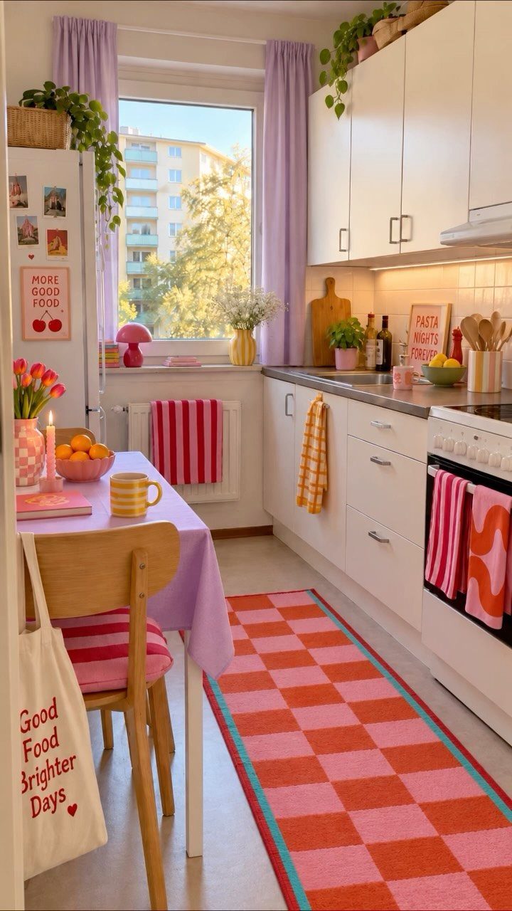
Lilac curtains against white cabinets work because the room commits to the color story rather than dabbling.
The maker repeats a tight palette throughout, and I can see it here: curtain, cushion stripe, checkered runner, even the print frames all pull from the same family.
I would add one or two small lamps on open shelving or a sideboard for evening light, as the maker suggests; overhead cans flatten color at night. The risk with this much pattern is clutter.
My rule is one large-scale print per sightline. Here the curtains carry it, the runner and cushion stay geometric and smaller, and the walls stay quiet.
4. Unique Artwork
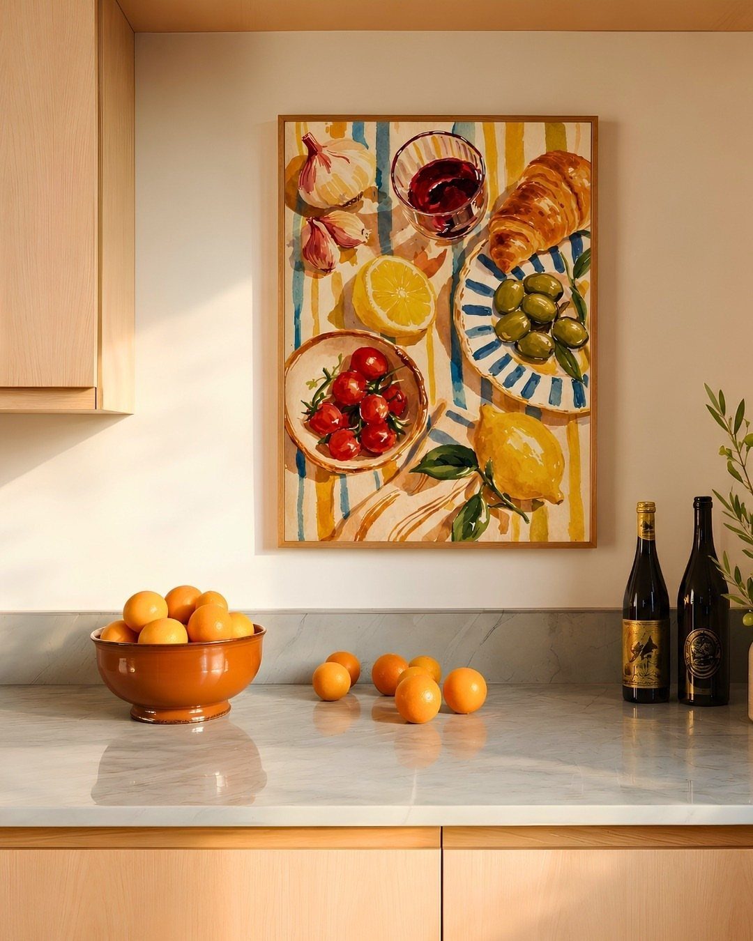
A single framed still life above the counter gives the kitchen the settled feeling of a room that was assembled over time, not installed in a weekend.
The oranges in the painting echo the real fruit on the marble, which is the kind of detail that makes the choice look intentional rather than random.
I look for art that picks up a color already in the room and a subject that belongs near food.
Vintage oil paintings of fruit or tableware surface at estate sales and online auctions for less than most new prints, and they carry a depth that thin-framed reproductions read flat against.
Size matters more than subject. This piece looks large enough to hold the wall alone without companions.
5. Functional Decor
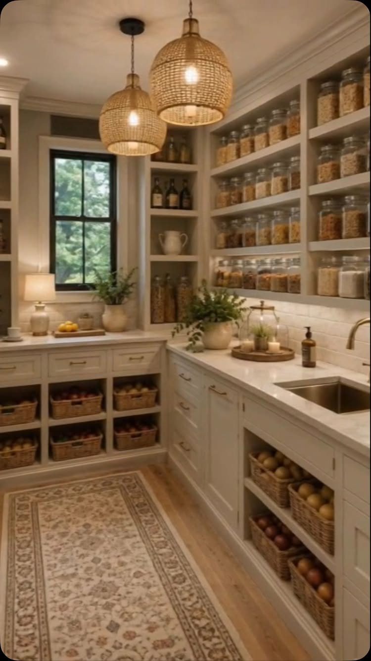
Glass canisters and woven baskets turn open pantry shelving into something you want to look at rather than hide behind a door.
Uniform jars create rhythm; baskets below add texture and handle the irregular shapes of produce and bread that jars cannot.
Leah, who designed this space, notes that the biggest change often comes from layout, not more storage.
I agree. Before buying a single basket, I sort what I actually reach for daily and give it the prime shelf at eye level.
The rest can stay behind closed doors. Rattan pendants warm up a pantry but need clearance from shelving below, and the good ones ask a price that reflects real handwork.
6. Colorful Kitchen Cabinets
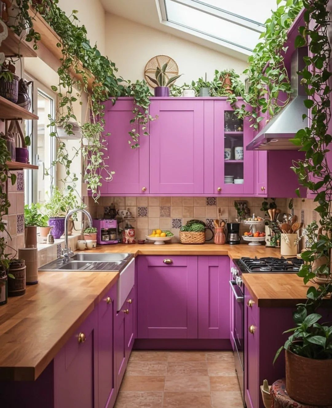
Purple cabinets with wood counters and trailing plants make a narrow kitchen feel like a deliberate choice rather than a compromise.
The saturation works here because the room gets enough light to keep the color from going muddy, and the wood grounds it.
I would test a sample door in the actual space for a week before committing. Purple shifts dramatically under warm LED versus daylight, and what reads bold in a south-facing room can turn bruised in a galley with one window.
The plants are doing real work too; green against purple is complementary without trying too hard. For renters, cabinet-grade paint on existing fronts costs a fraction of replacement and reverses on move-out.
7. Mirrored Backsplashes
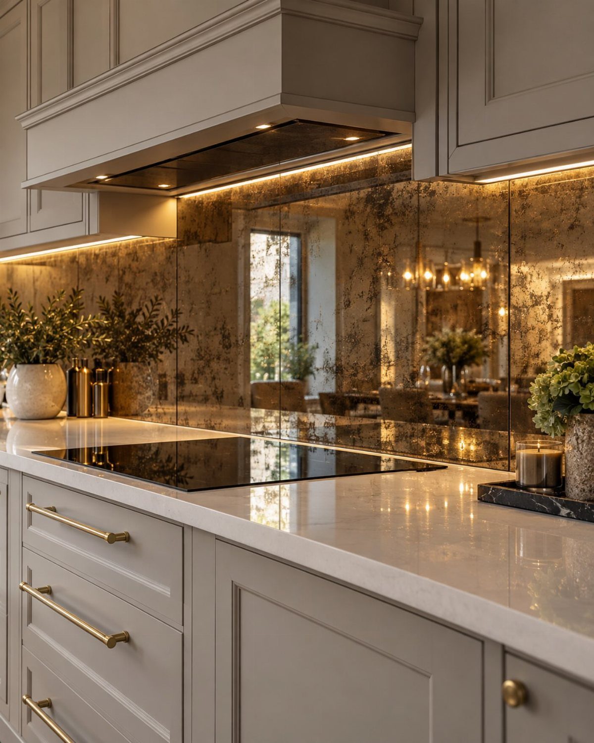
Antiqued mirror behind a cooktop catches under-cabinet light and throws it back into the room, which matters in kitchens that face north or sit in the middle of a house plan.
The mottled finish hides water spots and the small scratches that would show on plain mirror.
I would order a tempered panel rated for heat exposure; standard mirror backing can crack behind a gas range.
Installation needs a pro who works with glass, not tile, because the cuts around outlets and corners have to be exact. Cost runs higher than subway tile, but the light gain can replace a fixture.
8. Farmhouse Kitchen Decor
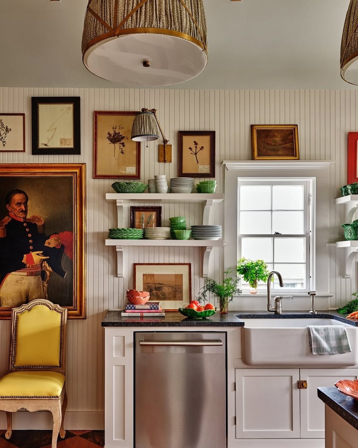
Beadboard on the walls reads farmhouse when the boards run vertical and the paint stays matte, not semi-gloss.
The look depends on restraint: one rustic element, like the apron sink, paired with cleaner lines everywhere else so the room does not turn into a set.
Shelves without doors let you stack plates and bowls where the color and shape do the decorating for you.
I would limit the display to one color family, as the green dishware does, and keep everyday clutter behind a cabinet door.
The yellow chair adds a point of color that keeps the white from going sterile. For renters, peel-and-stick beadboard panels go up without nails and remove clean.
9. French Country Kitchen
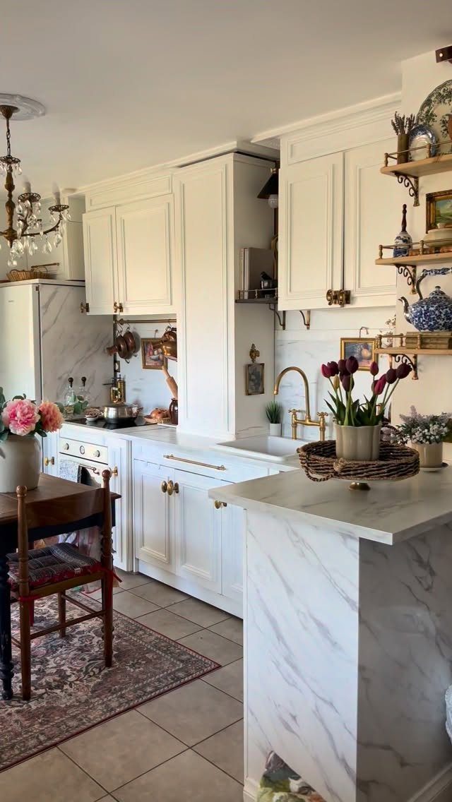
Marble counters with brass hardware and copper pots overhead give a kitchen the collected-over-decades feeling that defines French country. A chandelier in a kitchen reads as living space, not just work space.
I would start with the hardware and fixtures if the budget is tight. Vintage china on open shelves costs less than new and carries the patina the look needs.
The oriental rug underfoot adds warmth that tile alone cannot; a low-pile vintage or vintage-style rug works best because chairs slide and crumbs vacuum out.
The stove here is white enamel, which keeps the palette quiet against the brass and marble.
10. Coastal Kitchen
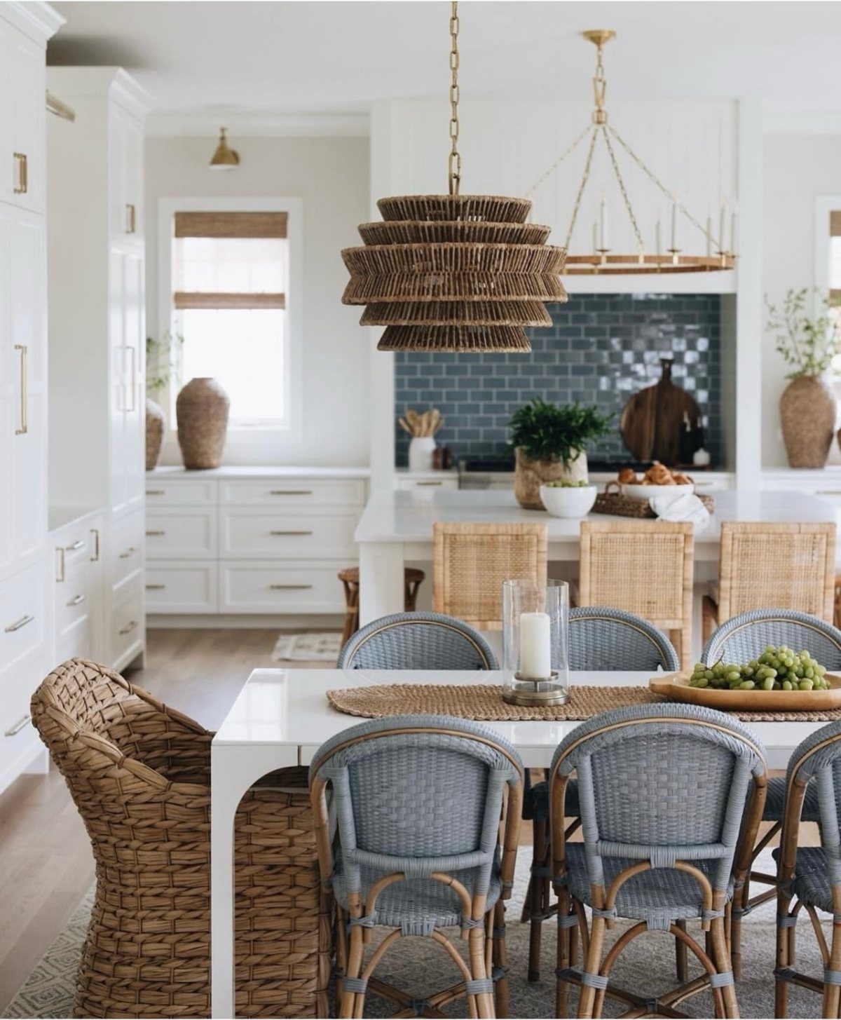
Blue subway tile and woven pendants give a kitchen coastal character without literal anchors or rope trim. The blue reads water, the wicker reads sand, and the white cabinets stay quiet so the two can carry the theme.
I would keep the blue to the backsplash or one feature; a blue island and blue tile together can tip into theme-park territory.
The woven pendants need to hang high enough that steam and grease do not settle into the weave, or choose a sealed rattan that wipes clean.
For renters, swapping pendant shades and adding blue textiles achieves most of the look without touching tile.
11. Vintage Rugs
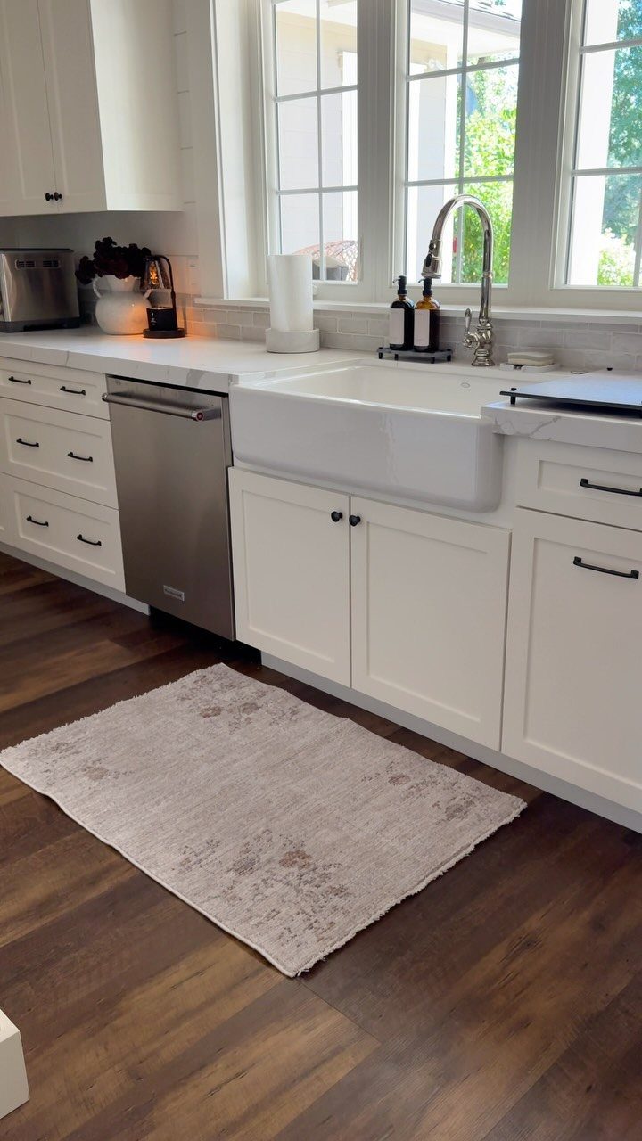
A small patterned rug in front of the sink softens the hardest-working zone in the kitchen and gives the eye a place to rest against all the hard surfaces.
The muted colors here keep it from competing with the cabinets and floor.
I would choose low pile and a cotton or synthetic blend that survives washing, because this spot sees water, grease, and traffic every day.
A rug pad cut smaller than the rug itself keeps it from sliding without adding bulk at the edges.
A small mat like this one takes concentrated wear, so even with care it will need replacing sooner than a full-size rug.
12. Checkerboard Tile
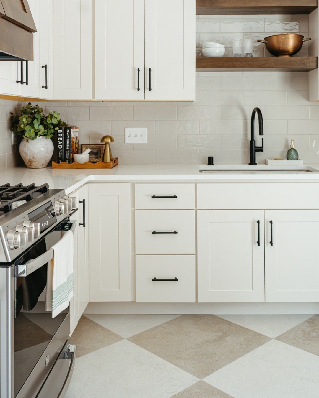
Checkerboard floor in cream and beige reads classic without the high contrast of black and white, which can feel more diner than kitchen.
The diagonal layout here makes the room feel wider than it is, a trick that works in galley plans.
I would use porcelain or ceramic tile rather than natural stone; the pattern is busy enough that veining and variation fight it.
Grout color matters: matching the lighter tile keeps the pattern crisp, while a mid-tone grout softens the whole floor.
Installation costs more than straight lay because the cuts multiply at every wall and cabinet toe-kick. For a weekend project, peel-and-stick vinyl tiles in the same pattern go down fast and lift when the lease ends.
13. Bold Lighting Fixtures
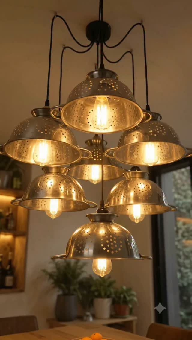
A chandelier built from kitchen colanders turns a found object into the room’s focal point without feeling like a craft project.
The metal reads industrial, the Edison bulbs keep it warm, and the scale above a table matters more than the fixture’s price.
I would check ceiling height before ordering anything this vertical; each tier adds inches that can block sightlines across a small kitchen.
Hardwired installation needs an electrician, but a swag kit and ceiling hook let renters hang a single-point fixture from an existing box and move it later.
14. Roman Shades
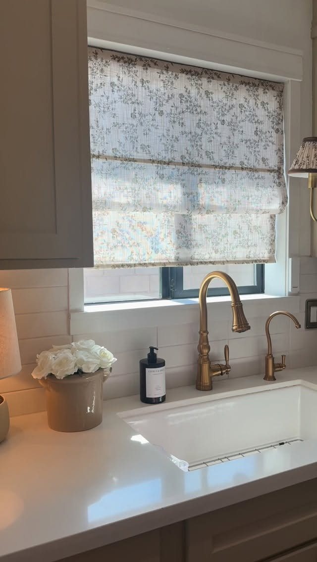
A Roman shade in floral fabric above the sink softens a kitchen window without the bulk of full curtains.
The tailored folds stay neat against the glass, and the pattern visible here repeats at a scale that reads from across the room, not just up close.
I would order the shade with a blackout or privacy liner if the window faces a neighbor; unlined fabric looks better but leaves the room exposed at night.
Inside mount keeps the sill clear for plants or soap, outside mount makes a small window read larger. Either way, measure width in 3 places and order to the narrowest, or the shade will gap.
15. Gallery Wall
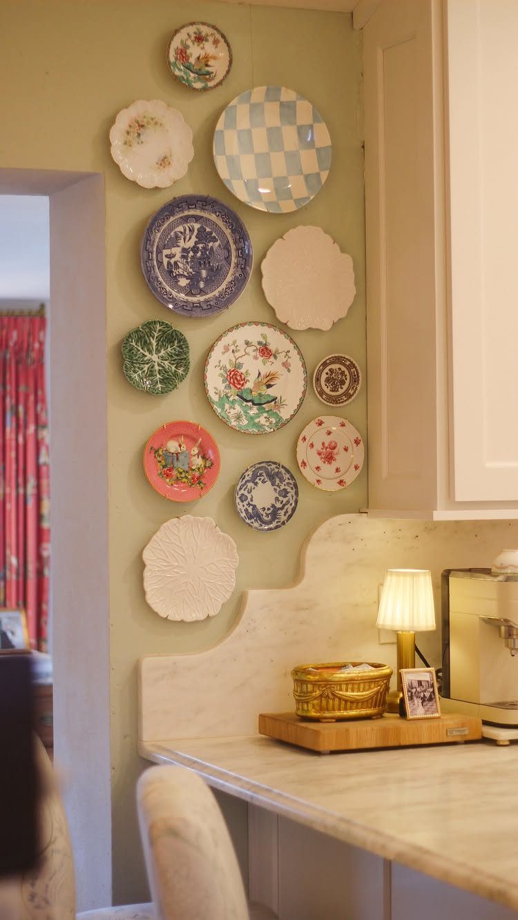
A wall of ceramic plates carries a collection without the framing cost of prints or paintings.
The round shapes break up the straight lines of cabinets and counters, and the mix of sizes lets the eye move rather than settle on one piece.
I would lay the arrangement on the floor first, photograph it, then transfer to the wall plate by plate.
Adhesive disc hangers work for lightweight ceramics and leave no holes; for heavier pieces, a nail through a wire loop on the back is safer.
The risk is visual noise. I would limit the palette to two or three colors and keep the plates close enough to the counter that they relate to the kitchen rather than floating in space.
16. Moody Dark Cabinets

Matte black cabinets with wood counters and under-cabinet lighting give a kitchen the atmosphere of a bar or restaurant without losing the warmth a home needs.
The wood here is doing the work of keeping the black from going cold; without it, the room would feel like a photo studio.
I would budget for good task lighting before committing to this palette. LED strips under the wall cabinets are cheap and install with peel backing; hardwired puck lights cost more but dim cleanly.
The wood backsplash visible here is a choice I would copy: it repeats the counter material and keeps the back wall from going flat black.
17. Indoor Kitchen Plants
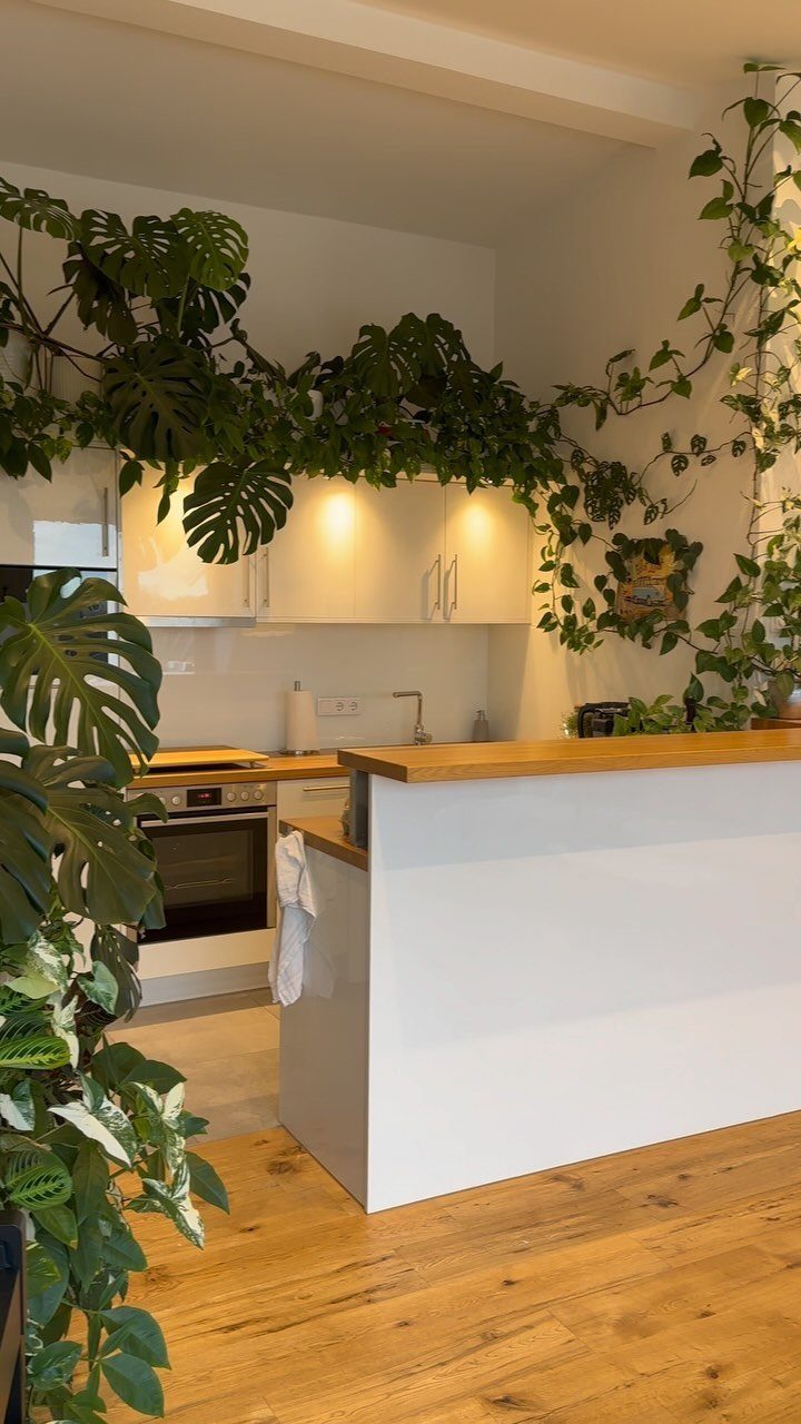
Climbing vines and large-leaf plants turn a white kitchen into something that feels grown, not installed. The green against white and wood is the color scheme, and the plants do the decorating without a single shelf or frame.
I would start with one forgiving plant, not this many. A pothos or philodendron trails from a high shelf with water once a week; a monstera needs more light and space than most kitchens offer.
The risk is moisture on cabinets and walls. I would keep climbing vines on exterior walls with good airflow, not pressed against upper cabinets where humidity can warp door fronts.
For a rental, potted plants on the counter and a single hanging planter achieve most of the look without altering anything.
18. Countertop Vignette Decor
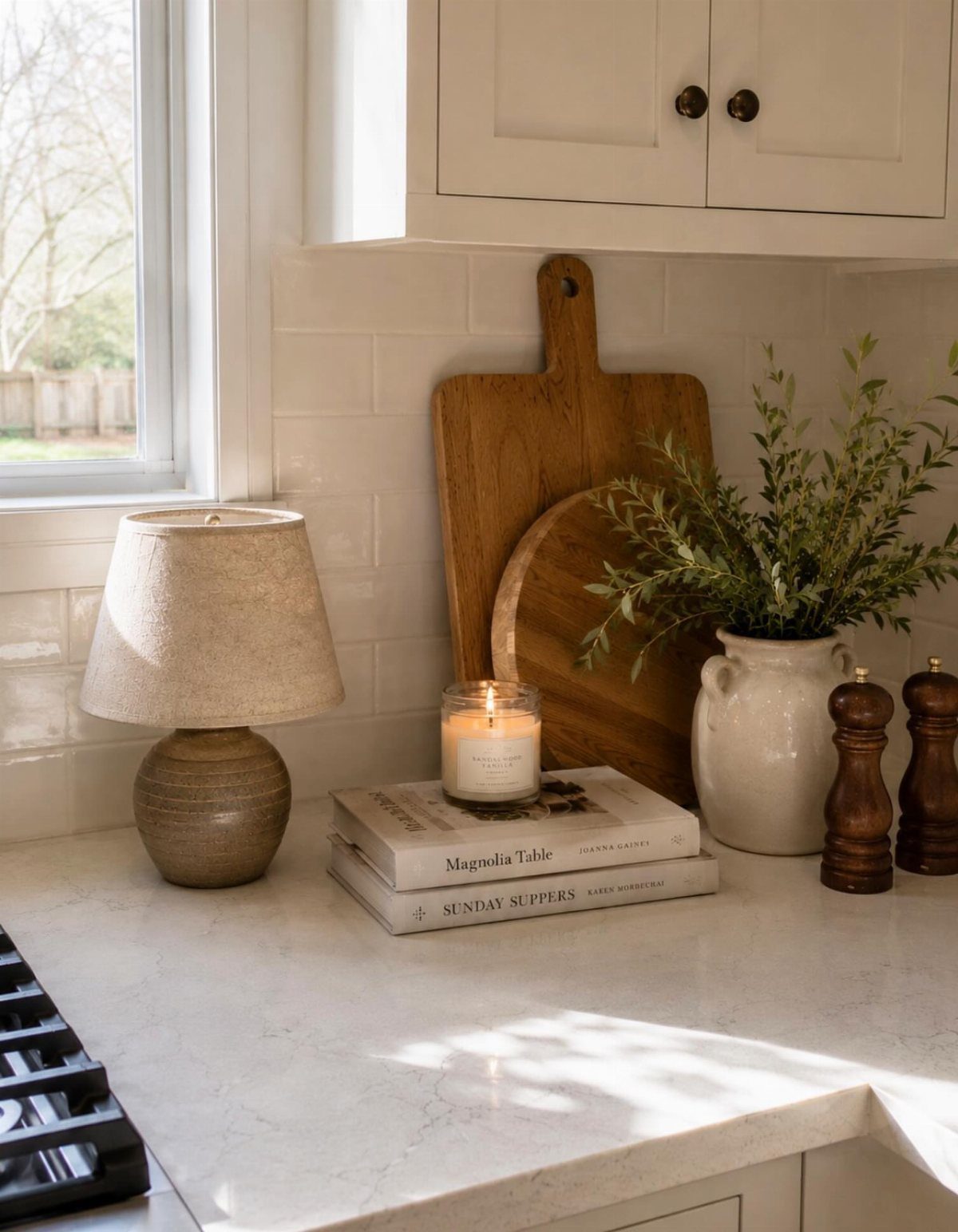
A cluster of cutting boards, stacked cookbooks, and a lit candle turns a few inches of counter into something intentional. The boards lean, the books stack, the candle sits on top: the height variation keeps it from reading as clutter.
I would limit this to a zone that does not see prep work.
A vignette behind the sink or on a side counter survives; one next to the stove collects grease and needs constant moving. The books here are doing double duty as a riser, which I like.
A lamp on the counter only works where an outlet is close and the cord can tuck behind; otherwise a battery candle gives the same glow without the wire.
19. Natural Wood Cabinets
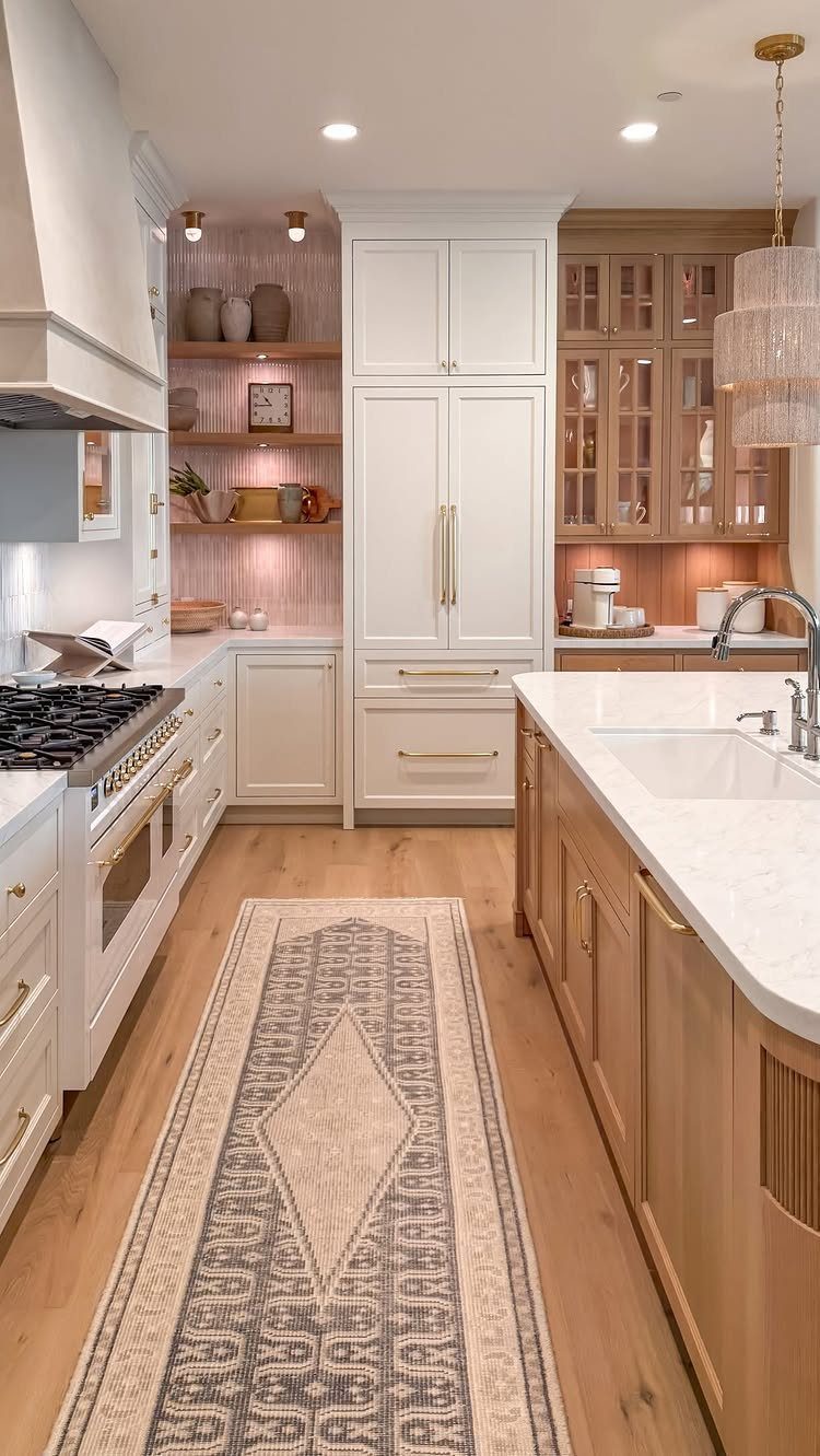
Natural wood cabinets keep a kitchen feeling warm without relying on color or pattern. The grain does the work, and the effect is quiet enough to live with for years.
I would choose a lighter oak or ash in a small kitchen; darker woods read heavier and can make a narrow galley feel like a hallway. The marble countertop here needs regular sealing or it stains.
If that maintenance does not fit, a quartz with similar veining gives the same contrast without the upkeep. A runner on wood floors protects the finish where traffic concentrates.
20. Built-In Banquette Seating
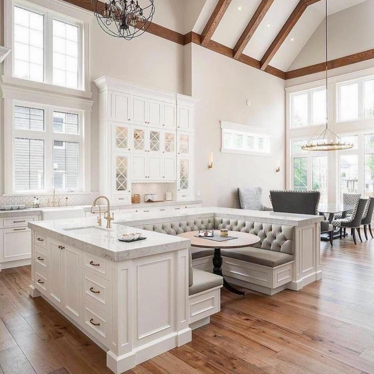
Built-in banquette seating turns a kitchen island into a dining spot without adding a separate table that breaks up the workflow.
The U-shape here seats more people than a standard island overhang, and the tufted back makes it comfortable enough for long meals.
I would check aisle width before committing. A banquette this size needs generous clearance on the open side for chairs to slide and people to pass.
The vaulted ceiling helps, but in a standard-height kitchen this same footprint would feel boxed in. Storage under the seats is standard; hinges that lift from the front are easier to use than tops that tilt up against the cushion.
21. Rustic Wooden Sideboard
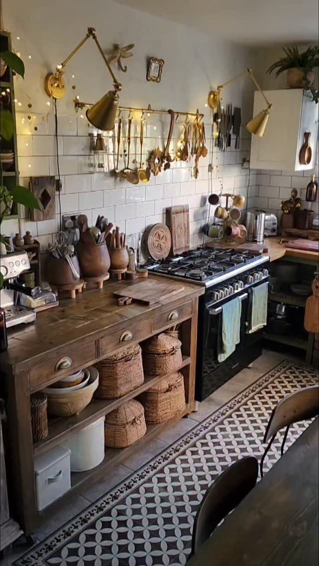
A rustic wooden sideboard gives a kitchen storage that does not look like kitchen storage. The drawers hide what you do not want to see; the baskets hold what you do not mind seeing but do not want to dust.
I would measure the wall height beside the stove before buying. A sideboard taller than the cooktop can block sightlines and make the range feel wedged in.
The brass sconces here need hardwiring or a cord channel; battery sconces exist now and remove cleanly. For renters, a sideboard on casters rolls to the next apartment, and the baskets swap out if the kitchen color changes.
Importance of a Kitchen Theme
A kitchen without a theme drifts.
You buy a mat because the color caught your eye, then a canister set that clashes, and soon the room feels like a clearance rack. A theme stops that drift.
It gives you a filter: farmhouse storage, coastal textiles, industrial hardware. The decision is made before you reach the checkout.
Buyers notice intention.
Even if selling is years off, the daily effect matters. Cooking in a room that feels resolved is calmer than cooking in one that nags at you.
The practical payoff is speed. A theme narrows the field fast.
You know what fits, so you stop second-guessing every piece. Shopping becomes faster, returns drop, and the pieces that arrive actually stay.
Maximizing Kitchen Light
Mirrors belong in kitchens that lack windows, not just in living rooms.
Light colors do the same work on a smaller scale. White cabinets and pale counters reflect what light enters; dark surfaces swallow it.
But a white kitchen can go sterile without texture. The combination is what works: reflective surfaces plus organic material, light palette plus tactile variation.
One mirror feature or several small textures works better than running both at full volume. 2 competing statements make the room feel restless.
Accessorizing Your Kitchen
Fresh flowers are the fastest way to add life to a kitchen that feels finished but flat.
Sunflowers, hydrangea, or peonies carry color and scent that no permanent object matches. Cut from your own beds if you have them; the irregularity reads better than florist perfection.
For color that turns over with the season, small accents do what paint or tile cannot. A set of canisters, a row of vintage bottles, a stack of bright bowls: these move in and out without commitment.
I would keep them to one hue per grouping, not a rainbow, and place them where they catch light from the window or under-cabinet fixture.
Textiles finish the room. Let the curtain carry it, or the rug, but not both shouting at once.
When it comes to kitchen decor ideas, don’t be afraid to get personal. “Try to consider the style of your home and your family when adding small touches,” says Erika Jayne Chaudhuri of Erika Jayne Design Build in Bethesda, Maryland.
Frequently Asked Questions
What are the most popular kitchen design styles today?
Farmhouse, coastal, French country, and modern moody palettes are the styles I see most often in real kitchens right now.
Scandinavian simplicity and industrial elements still show up, but the ones that stick are the ones that handle daily life without looking staged.
Farmhouse works because it lets you mix old wood with clean cabinets; coastal and French country give you a color story that holds together when you add pieces over time.
Can I mix multiple kitchen design styles?
Yes, but the mix needs one thread that repeats, or the room falls apart. I would keep the palette tight: warm white and matte black bridge farmhouse and industrial, while blue plus natural wood ties coastal to Scandinavian.
The danger is collecting one piece from each style until the kitchen reads as a clearance rack. My rule is two styles max, with one material that shows up in both, like wood counters or brass hardware.