A kitchen backsplash can run from peel-and-stick tile you install Saturday morning to a full marble slab that needs a second slab budget and a contractor who knows how to seam it.
What decides it is whether you are finishing a room you already live in or building the look the rest of the kitchen will have to follow.
The list below moves from hand-painted tile with food-safe glaze ratings to rough-cut stone block that needs plumbing roughed in before the wall goes up, with 15% overage on hexagons and a poultice kit for oil stains on marble.
1. Marble Subway Tile
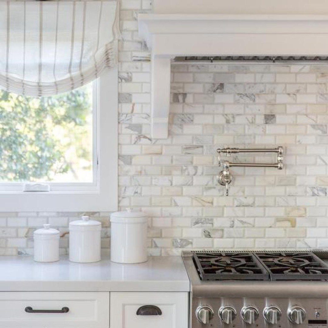
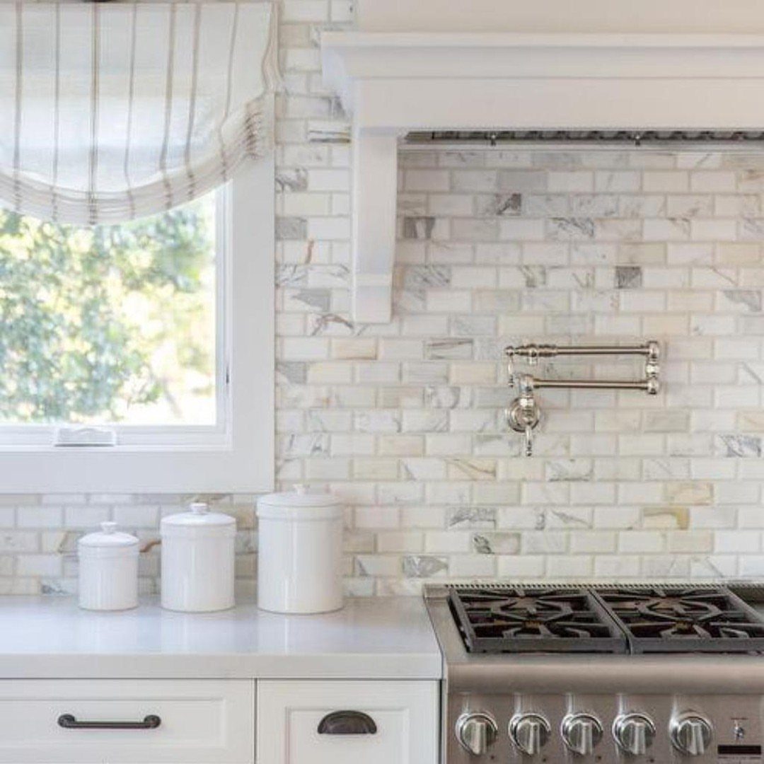
Marble subway tile reads as a deliberate upgrade rather than a default choice. The veining gives each piece its own character, so I always tell clients to lay out several square feet on the floor before committing to the arrangement.
Natural variation means some tiles will read almost solid white and others will carry heavy grey movement; you want to balance those across the wall, not cluster the busy ones.
The material is softer than porcelain, so etching from splatter behind the stove is a real concern. I would seal it before grouting and again after, and I would keep a poultice kit on hand for oil stains.
2. Hand-Painted Tile
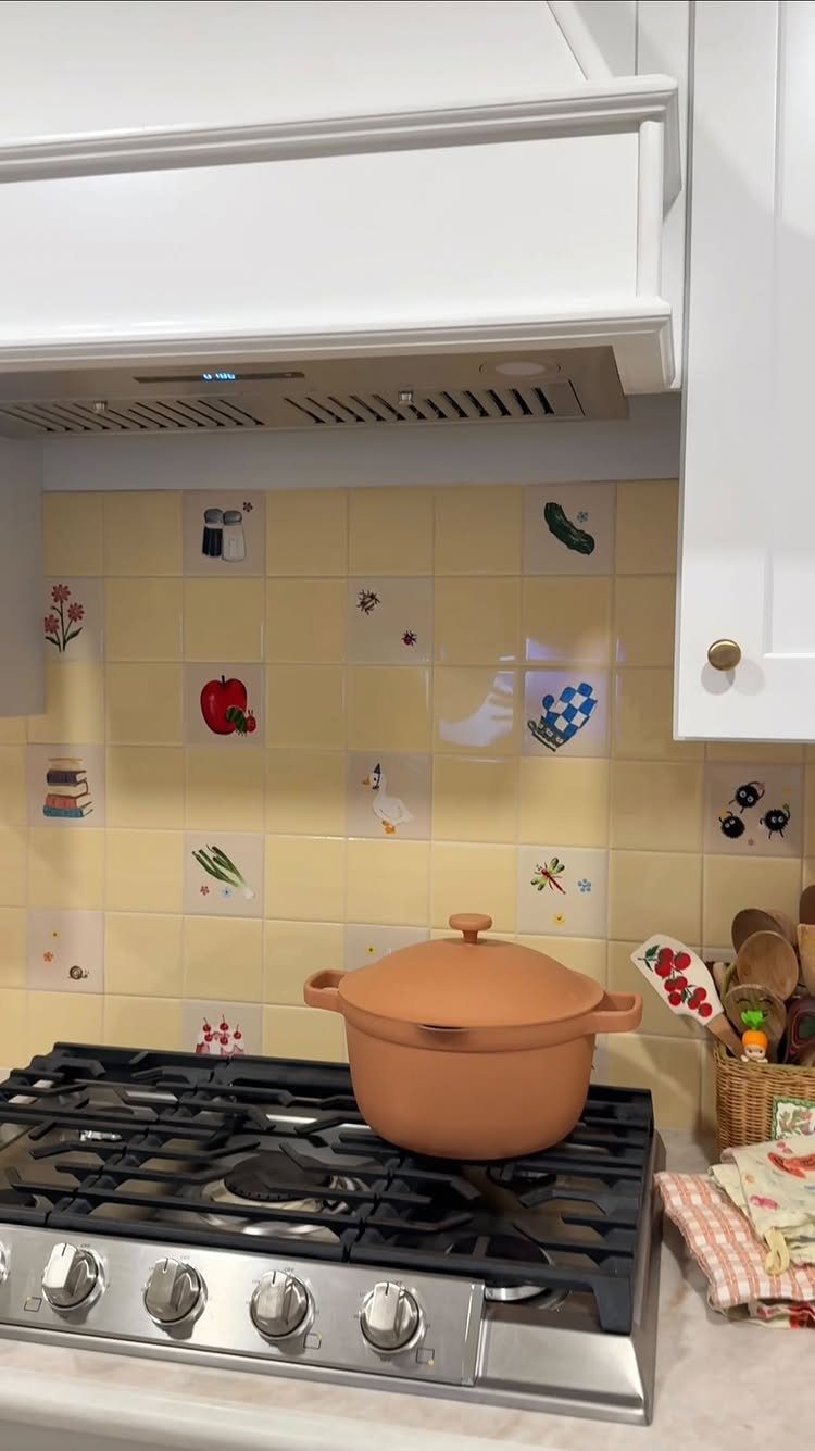
Hand-painted tile is the one backsplash choice where imperfection is the entire point. Each piece carries the slight wobble of a brushstroke, and the spacing between illustrations will never be mathematically even.
That irregularity is what separates artisanal work from factory decaled lookalikes. For a kitchen you actually cook in, I would check whether the glaze is food-safe rated and whether the surface texture will trap grease near the range.
The terracotta body visible in some of these pieces is more porous than porcelain; sealing matters here too. I would order more overage than the standard amount, since matching a specific hand is impossible months later.
3. Narrow Band of Colorful Tile
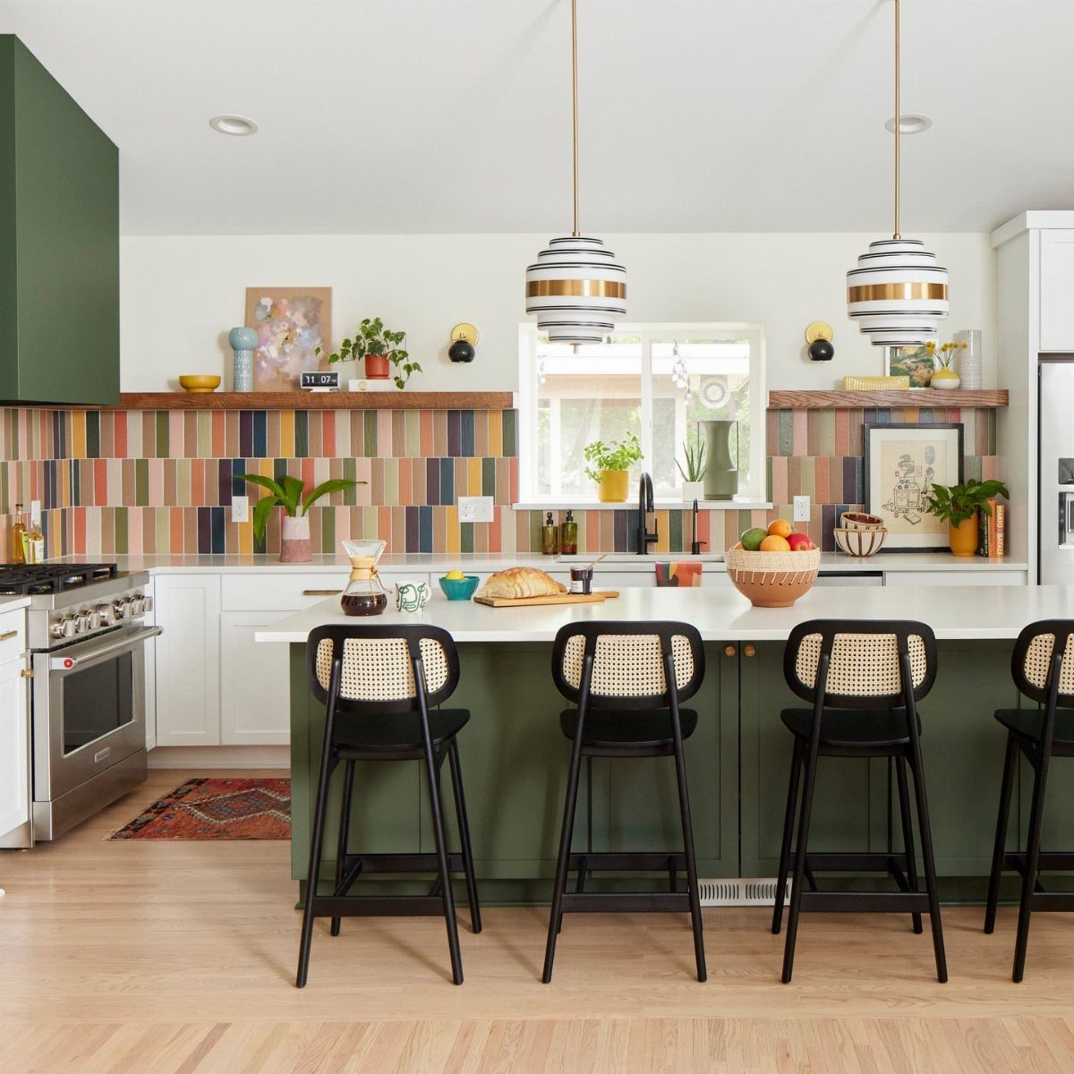
A narrow band of colorful tile does its job by doing less. A narrow band of tile at eye level under a single shelf keeps the backsplash from competing with a green island or wood grain.
I see this working best when the accent color already exists somewhere else in the room, even in a small dose.
The band needs precise height: too narrow and it looks like a mistake, too tall and it becomes a feature wall you did not plan for.
I would keep the band narrow and align the top with the bottom of wall cabinets or the underside of a floating shelf, whichever gives you a clean horizontal line to work from.
4. Black Natural Stone
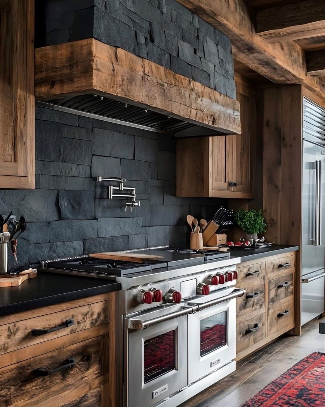
Black natural stone pushes back against the assumption that kitchens must read light and airy. Stacked texture catches light unevenly, which keeps a dark surface from going flat.
I would not attempt this in a kitchen with small windows or a single overhead fixture; the stone needs cross-light from a window or under-cabinet strips to show its dimension.
The range hood in the same material is a commitment, since grease filtration becomes invisible against that tone.
I would plan on more frequent cleaning than the stone’s rustic look suggests, and I would choose a honed rather than polished finish to hide water spotting.
5. High Gloss Zellige Tile Backsplash
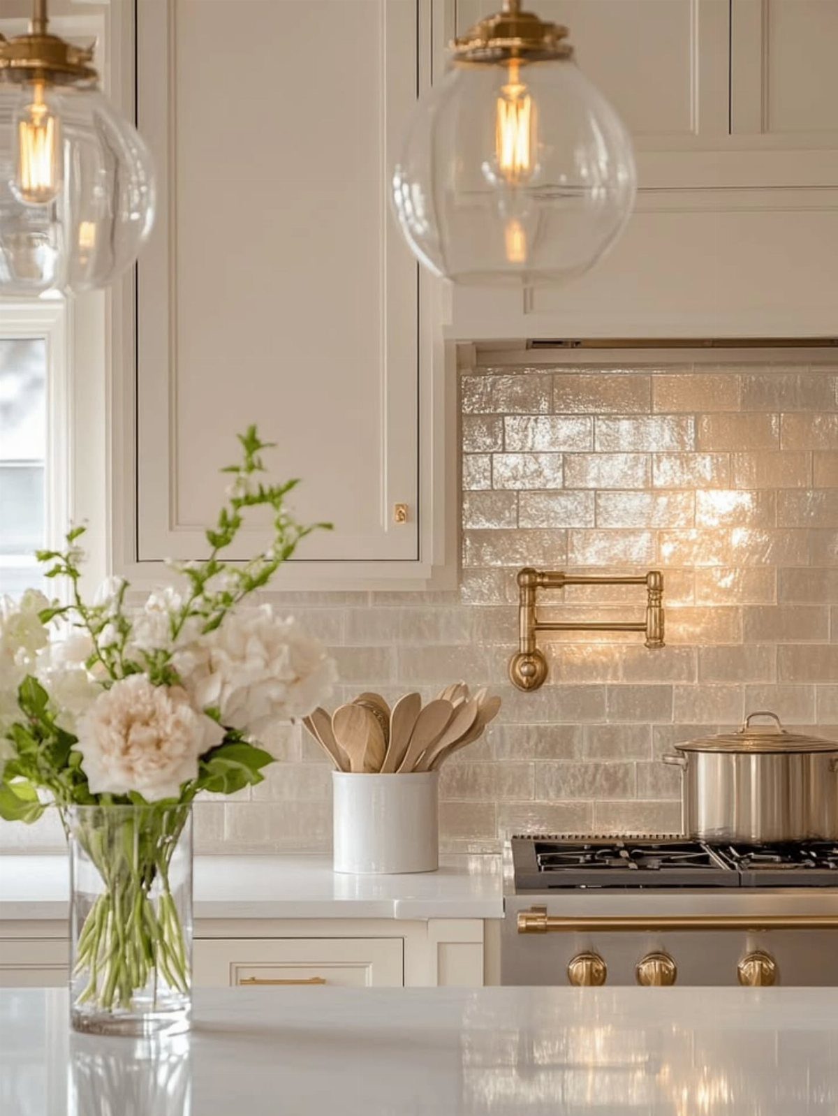
High gloss zellige tile carries the uneven surface and dimensional glaze of traditional Moroccan production, which means no 2 pieces reflect light the same way.
The variation is intentional, and I would not try to grade or sort the tiles into matching stacks.
Installation is slower than standard subway tile because the edges are not perfectly rectified; the installer has to eyeball each joint rather than rely on spacers.
A brass pot filler picks up the warm undertone in the glaze, and I would carry that metal through the cabinet hardware rather than mixing finishes.
Gloss this deep will show every fingerprint and water spot on the lower rows; I would keep a microfiber cloth tucked in the cabinet below the sink.
6. Checker Backsplash Ceramics
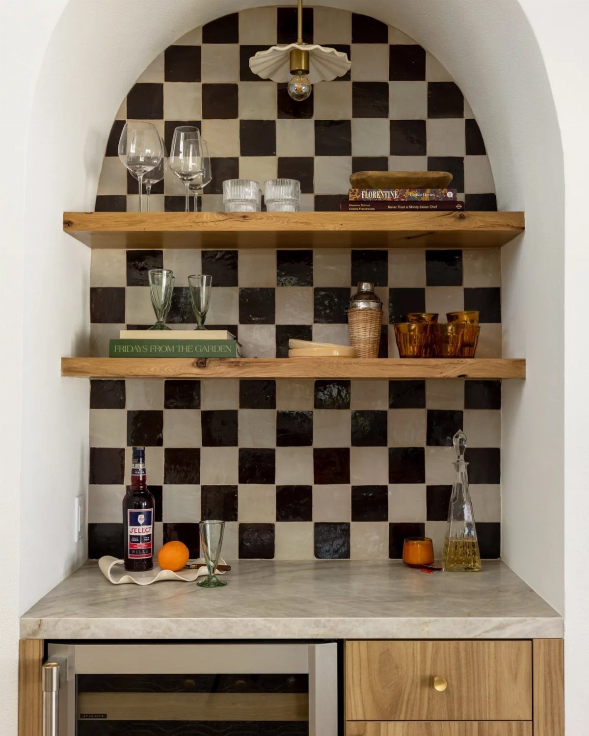
Checkerboard ceramics read as pattern first, material second, which is why they work in a small zone like this arched bar nook.
Black and white is classic, but the scale of the check matters more than the colors. Large squares feel graphic and modern, small ones read historical; a middle size sits right between the two.
I would not run this pattern across a full kitchen wall behind open shelving, where the visual noise competes with dishes and glassware.
The alcove framing helps contain it. For a similar effect in a rental, peel-and-stick checker vinyl exists, though the grout lines will never look this crisp.
7. Classic White Subway Tile
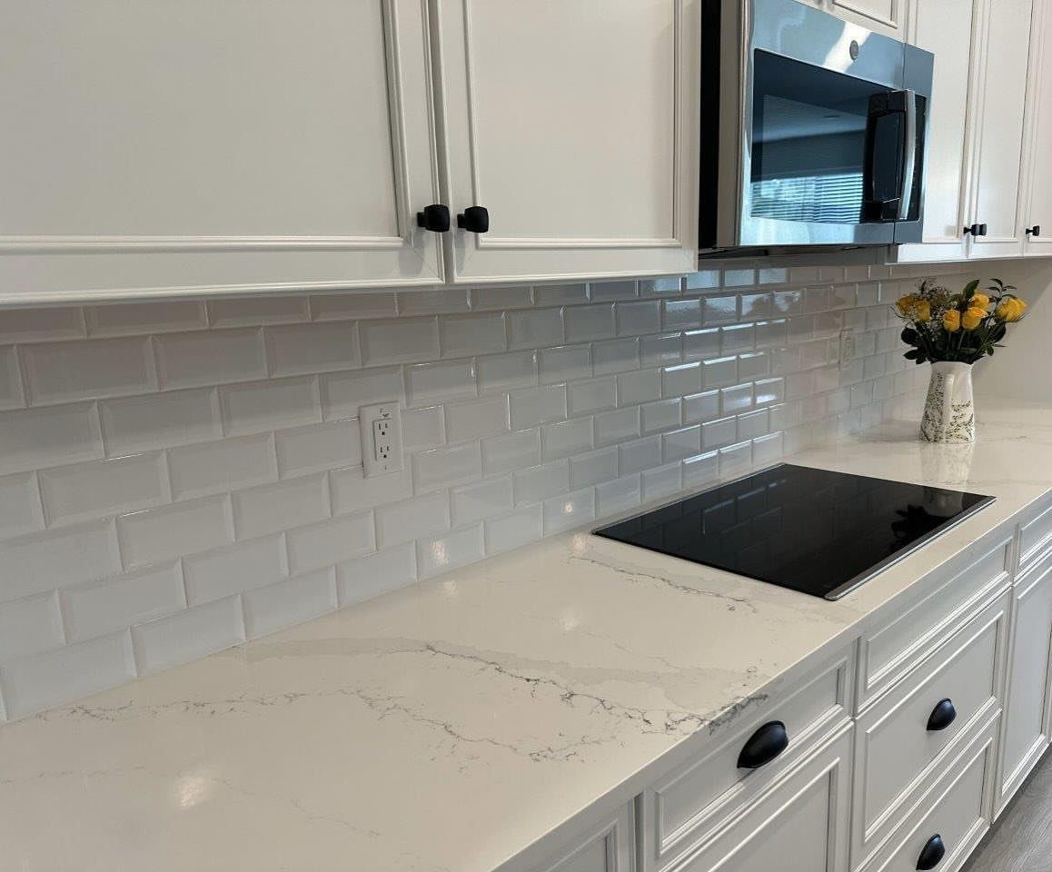
White beveled subway tile is the safe choice that still earns its place through proportion.
The bevel catches light at the edges, so the wall reads as texture rather than blankness. I would decide on grout before ordering: white grout disappears and keeps the look quiet, grey defines each tile and adds grid.
The visible installation runs brick pattern, which is standard for a reason; stack bond reads more modern but shows every waver in the wall.
This is the option I suggest when resale matters or when the countertop and cabinets already carry enough interest.
8. Bold Pattern
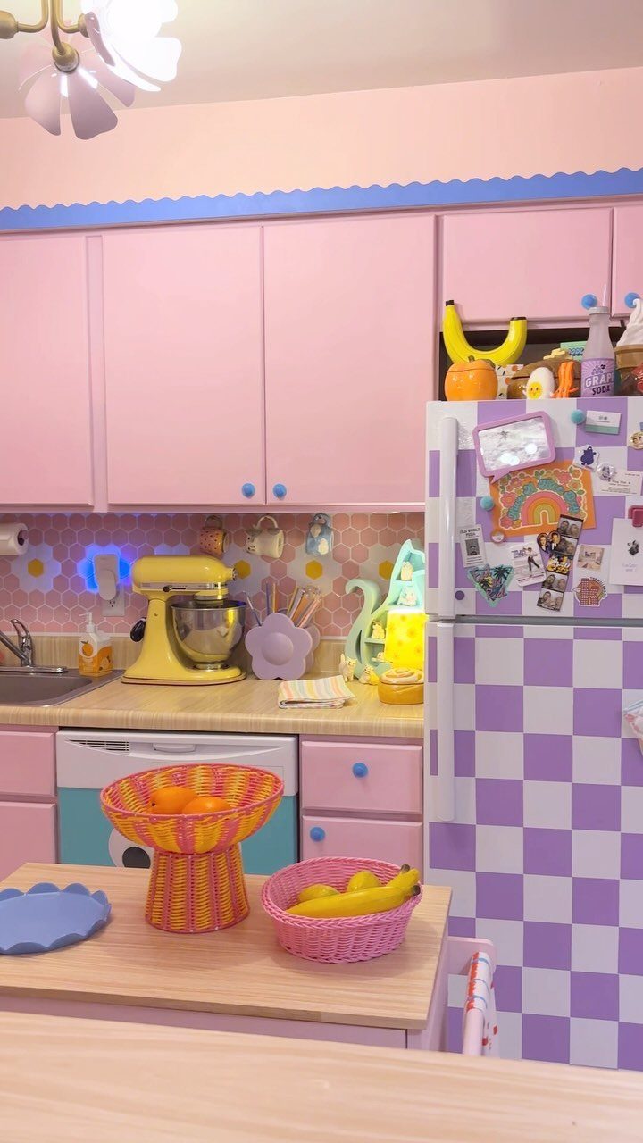
A floral hexagon backsplash in pink and yellow is not a background element; it is the reason the room exists.
I would not attempt this unless the cabinetry and appliances commit to the same register, as they do here with the checkered refrigerator and pastel casework.
The pattern needs room to breathe, so I would keep upper cabinets minimal or absent in the zone where the tile runs.
The visible layout arranges hexagons into daisy motifs, which means precise alignment during install; a half-motif at the edge ruins the effect. I would order a paper template from the supplier and map every sheet before the setter mixes thinset.
9. Textured 3-D Tile
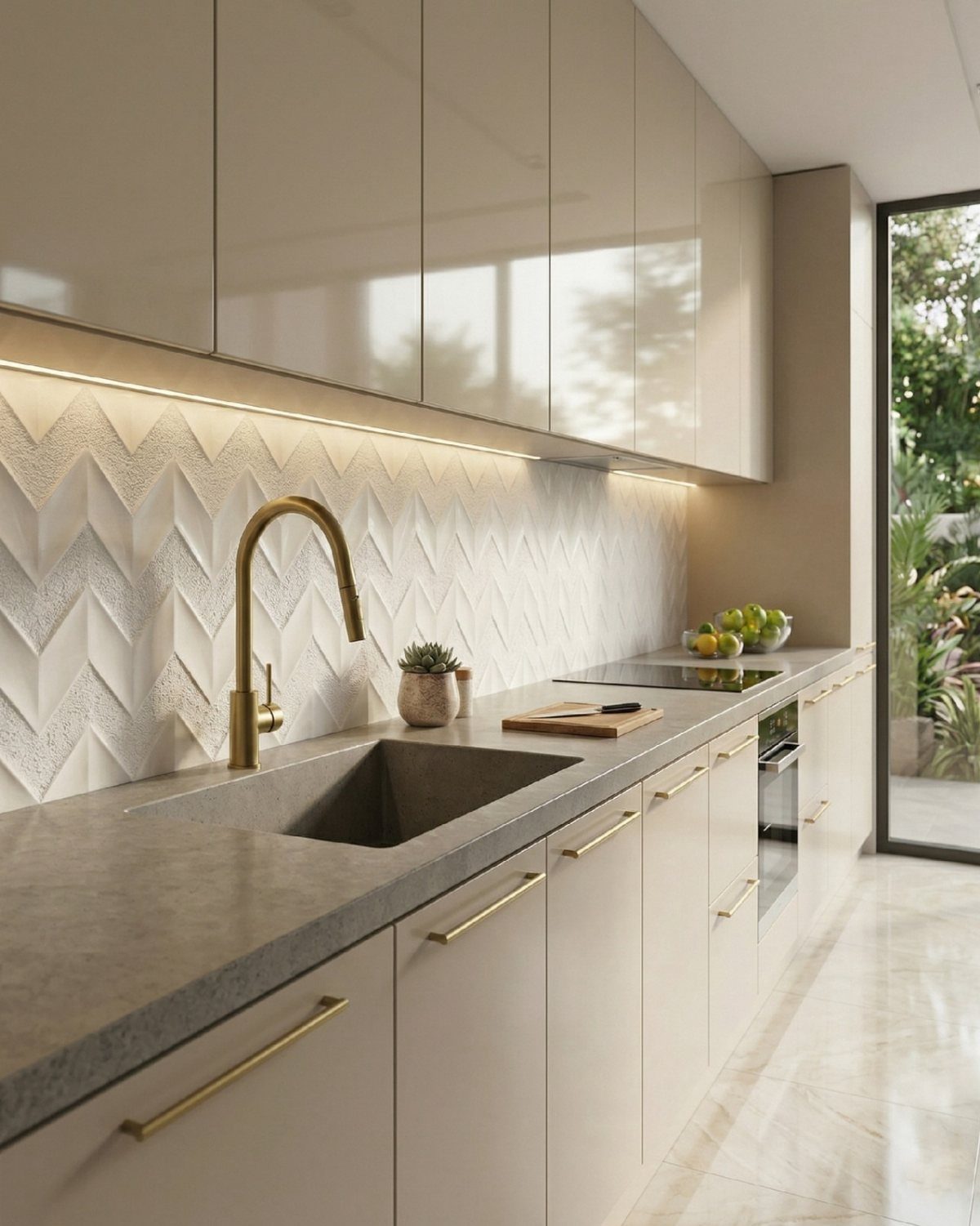
Three-dimensional chevron tile turns under-cabinet lighting from task illumination into a display mechanism. The visible installation runs white glaze over concrete-toned body, with ridges that cast shadow in alternating directions.
I would plan the lighting before the tile: LED strips too close to the wall flatten the effect, too far and the shadows go ragged.
A concrete sink and brass faucet keep the palette restrained, which this tile needs; I would not pair it with busy countertops or hardware that competes for attention.
10. Large-Format Tiles
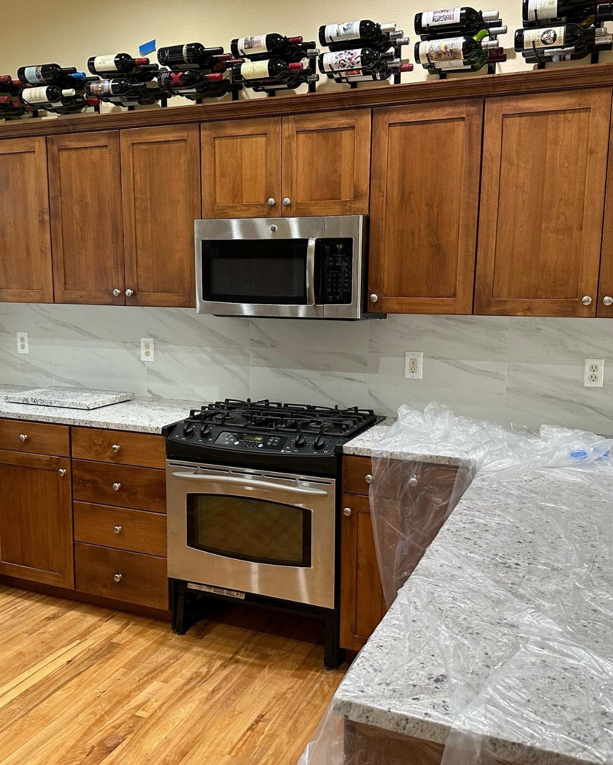
Large-format tile cuts grout lines to nearly nothing, which matters when the pattern is meant to read as continuous stone.
The visible installation runs marble-look porcelain between wood cabinets and speckled granite; the tile has to hold its own against both without matching either. I would check flatness of the wall before committing, since big tiles telegraph every bump.
A leveling system is not optional at this size; the slight lip between sheets that reads as texture on small subway tile becomes a trip hazard for the eye here.
Mid-install is when I would verify that the outlet cuts land in grout joints, not centered on a veined field.
11. Chevron Backsplash
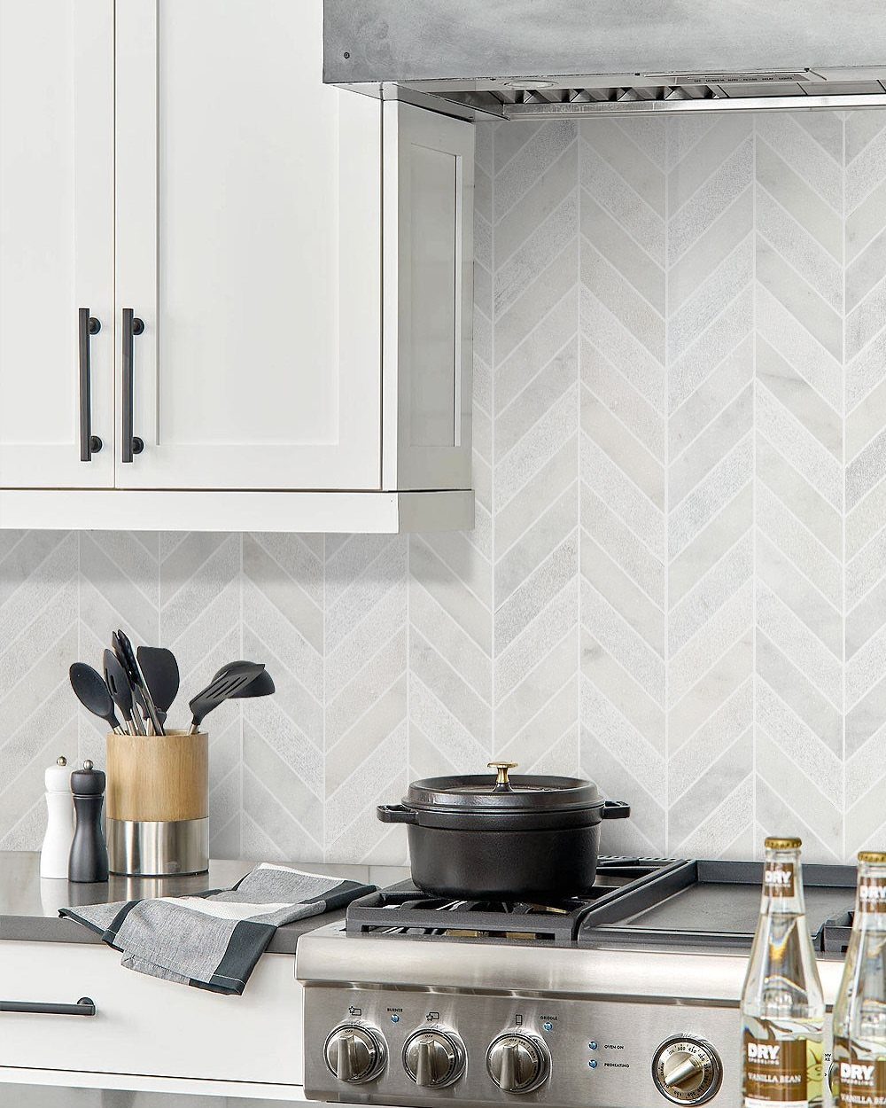
Chevron in light grey marble turns the backsplash into a directional gesture pointing toward the range.
The visible installation runs the pattern vertical, which draws the eye up and works with the horizontal of the white uppers; horizontal chevron would fight the cabinet line.
I would set a full point at the center of the range hood and work outward, accepting that the edges will need cuts.
The marble variation here is subtle, which I prefer for this pattern; high-contrast veining would make the geometry dizzy. A black pot on the stove shows the tonal range this palette accepts.
12. Metallic Tiles Backsplash
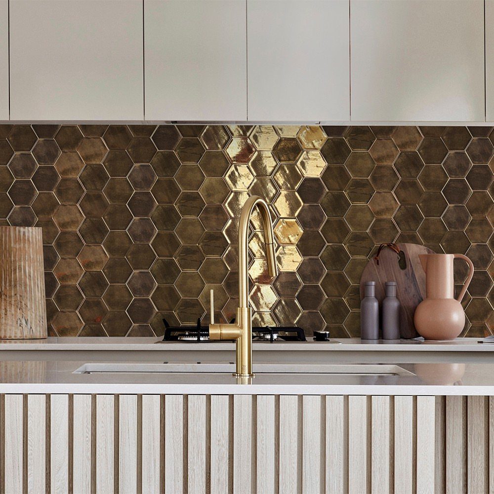
Dark gold hexagon tile in reflective finish is the single backsplash choice that behaves like a mirror. The visible installation sits behind a brass faucet on a white counter, and the tile picks up both tones while adding its own.
I would not use this across a full wall in a small kitchen; the reflection doubles visual clutter. The hexagon shape already reads as pattern, so I would keep grout tight and tonal to avoid a third competing element.
Fingerprints and water spots show on this surface the way they do on stainless appliances; I would keep a glass cleaner with the dish soap and accept the maintenance as part of the look.
13. Salvaged Brick Backsplash
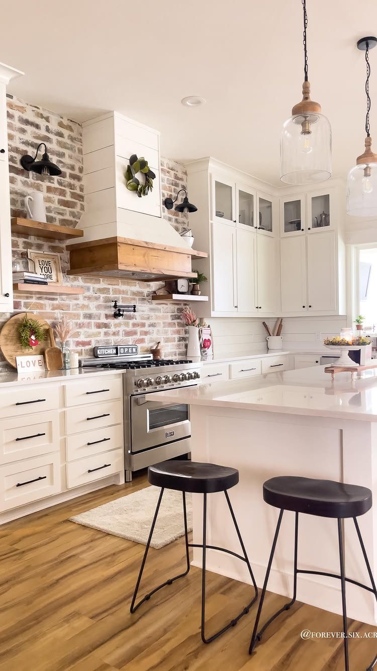
Salvaged brick carries the mortar stains, kiln marks, and soft edges that new brick spends decades trying to fake. The visible installation reads as white-washed farmhouse, with enough original color bleeding through to keep it from looking painted drywall.
I would check lead content on anything salvaged from a demolition-era building; a sealant coat keeps dust and grease from settling into the porous surface.
The full-height run here works because the cabinets are simple and the counters are quiet. In a smaller kitchen, I would stop the brick at cabinet height to avoid heaviness.
14. Limestone Backsplash
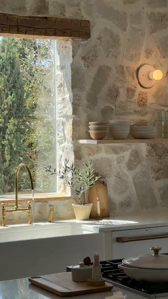
Rough-hewn limestone turns the wall itself into the backsplash, which saves the step of installing a separate material but demands more from the substrate.
The visible stone runs from counter to ceiling with an open shelf cutting across it; I would plan shelf bracket placement before the stonework begins, since anchors through limestone are not something you add later.
The brass faucet picks up the warm tone in the stone, and the large window gives the texture the light it needs to read as dimensional rather than merely rough. Sealing is non-negotiable behind the sink.
15. Iridescent Tile
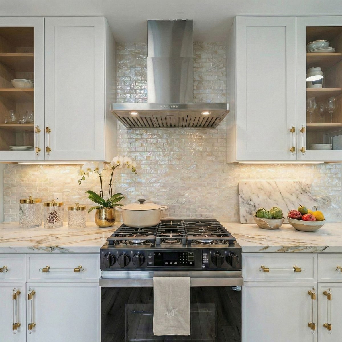
Iridescent subway tile shifts color as you move through the room, which means the backsplash performs differently under morning light than it does once the sun drops.
I would test samples under the actual under-cabinet LEDs, since the color temperature of the light determines whether the iridescence reads subtle or disco.
Grout choice matters more here than on standard tile; white keeps the shimmer central, grey grounds it.
16. Glass Block Backsplash
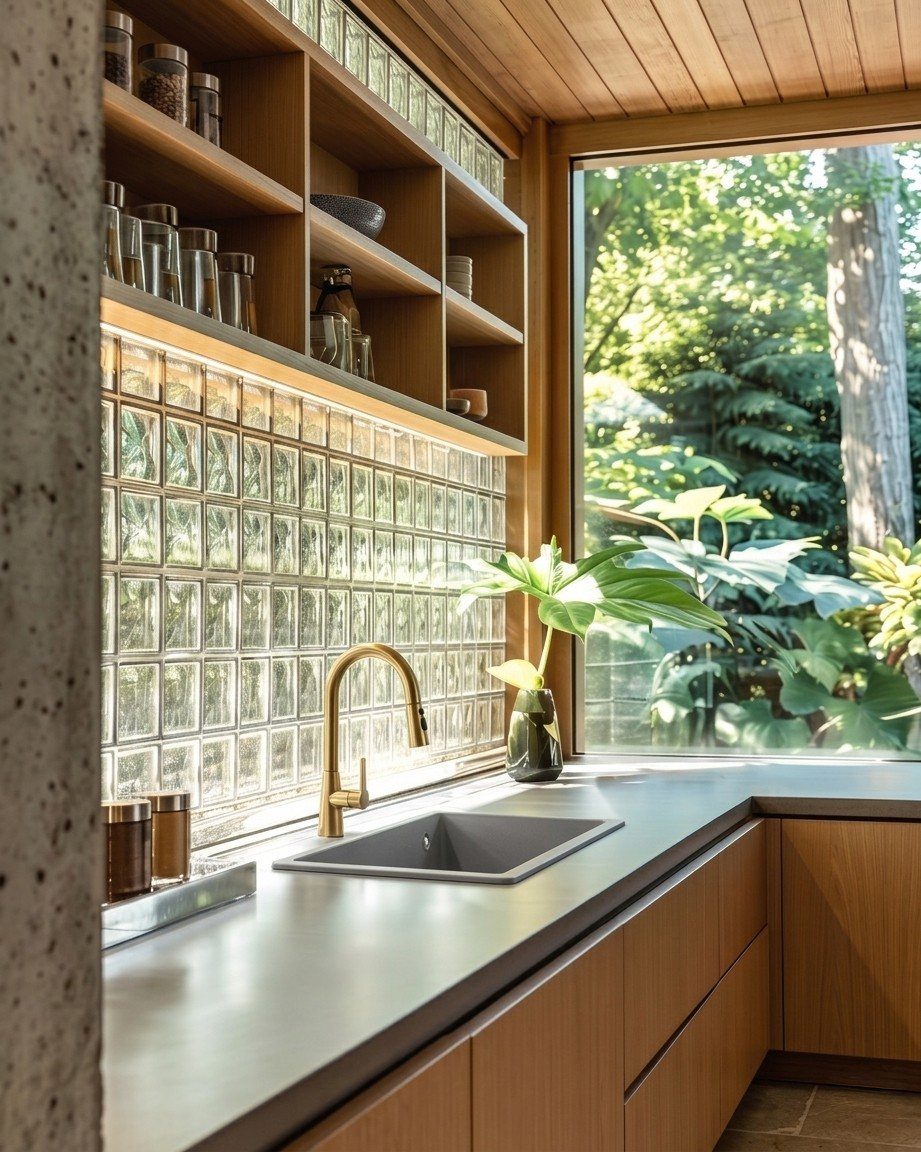
Glass block transmits light while blocking the view, which makes it a practical choice for a sink wall that faces neighbors or an alley.
The visible installation sits below a window and above wood cabinets, with the block acting as a light well rather than a solid backsplash.
I would verify that the wall structure can handle the weight; standard glass block is heavy per piece and mortar beds add more. The brass faucet and open shelving keep the look warm; without those, the effect can read institutional.
17. Wood Grain Tile with Colorful Grout
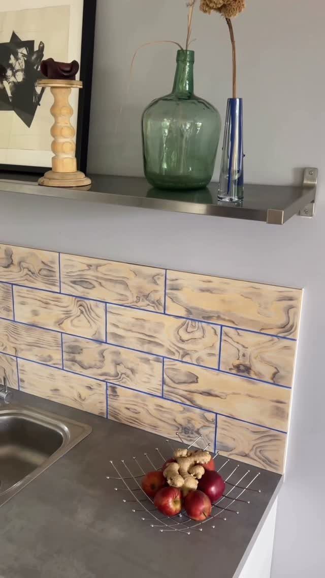
Wood grain tile with colored grout is the rare backsplash that lets you commit to pattern and color at the same time without visual chaos.
The visible installation runs pale wood-look rectangles with sharp blue grout lines that read as deliberate graphic detail.
I would mock up the grout color on actual tile before mixing; the same blue reads as coastal on white oak and as electric on ash.
A floating metal shelf above keeps the look clean without competing for attention. This is a rental-friendly option if you use groutable vinyl tile, though the texture will differ.
18. Rough Cut Stone Block Wall
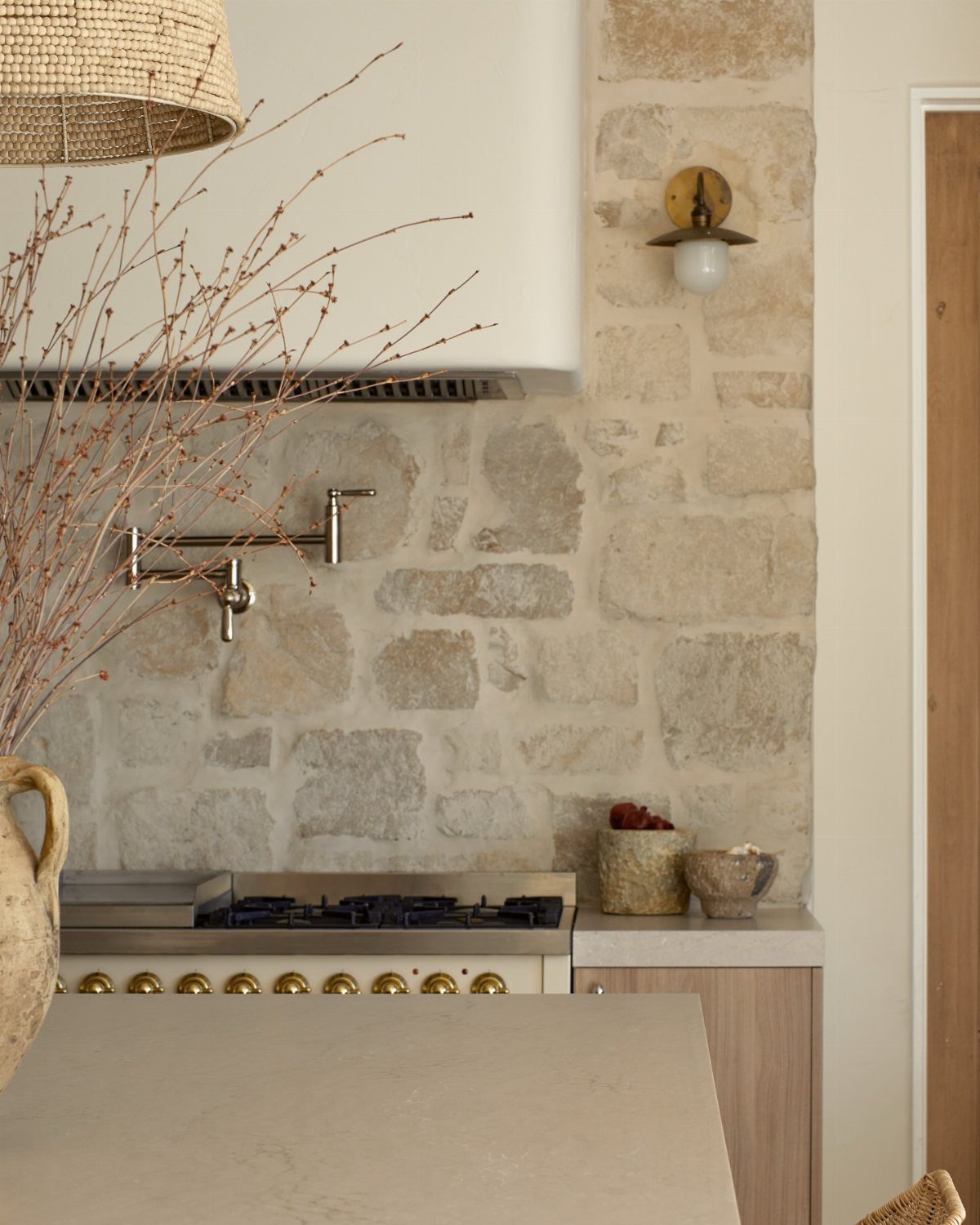
Rough-cut stone block behind a range reads as hearth, which is the right association for the place where actual fire lives.
The visible installation runs large irregular blocks with visible mortar joints and a pot filler mounted directly into the stone; I would rough in plumbing before the wall goes up, since retrofitting through stacked stone is nearly impossible.
The range hood and sconce share a dark metal finish that keeps the appliances from floating against the texture. I would budget for a structural assessment; stone this thick is heavy, and standard cabinet backing will not carry it.
19. Vertical Stacked Subway Tile
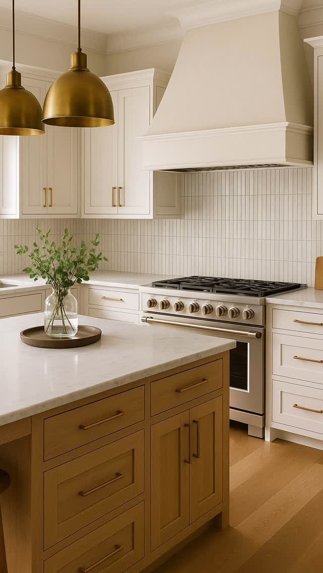
Stacking standard subway tile vertically turns a familiar material into something that reads as current without demanding a specialty order.
The visible installation runs white subway tile in straight columns from counter to ceiling, which draws the eye up and suits the tall hood run behind it.
I would check plumb on every column; stack bond shows waver immediately, and vertical lines have nowhere to hide.
Grout here is white and tight, letting the rhythm of the joints do the work. This layout costs the same as standard brick pattern and uses the same tile; the only difference is the setter’s patience.
20. Hexagon Tile Backsplash
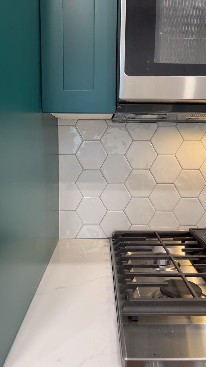
Hexagon tile brings geometry that reads as pattern even in a single color, which is how the visible installation keeps it calm against teal cabinets.
The white hexagons run small enough to read as texture from a few steps back, and the grout is dark enough to define each shape without fighting the cabinet color.
I would order 15% overage instead of the usual 10; hex cuts waste more at edges and corners than rectangles do.
The cooktop and microwave in this kitchen are standard sizes, so the tile field never has to navigate an irregular appliance cut, which simplifies the layout.
21. Matching Marble Slab Backsplash
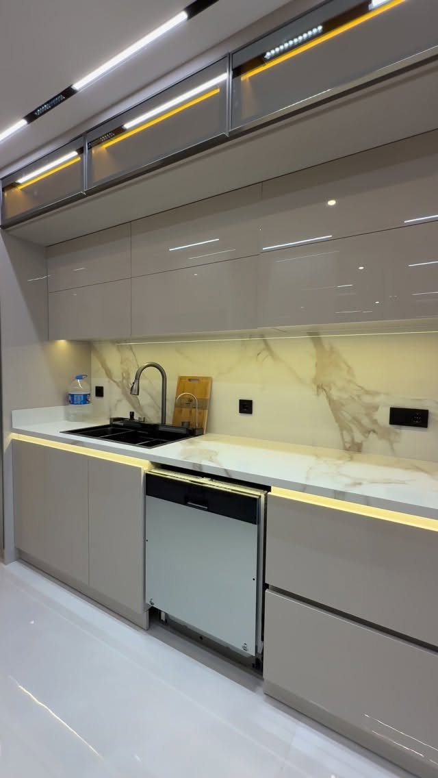
A full marble slab behind the sink removes every grout line and lets the veining run continuous from counter to cabinet.
The visible installation uses the same stone as the island and perimeter counters, which means the backsplash was templated after the tops were cut, not before.
I would budget for a second slab even if one seems sufficient; matching veining across counter and backsplash is a fabricator’s puzzle, and you need the material to solve it.
Under-cabinet lighting here is essential, not decorative, because the gloss of polished marble turns shadow into glare without it.
Choosing the Right Material
Ceramic and porcelain carry most kitchen backsplashes for good reason. Glass reflects light and cleans easily, though it chips more readily than stone or porcelain and shows every fingerprint on a reflective finish.
Natural stone brings variation no factory can replicate, but the porosity is real: limestone, marble, and rough-hewn cuts all need sealing before grouting and periodic resealing after.
I would not install stone behind a cooktop without accepting that maintenance schedule. Mosaic sheets add visual density, though more grout lines mean more surface area to clean and more opportunities for staining if the grout seal fails.
Remember: your backsplash does serve a function other than simply looking pretty. While you’re planning out your kitchen backsplash, make sure that it’s made from a material that actually makes sense for how you live and cook.
Installation Tips
Drywall alone works for a backsplash zone that stays relatively dry, though I would not trust it behind a sink or anywhere steam concentrates regularly.
For those areas, cement backer board adds the moisture resistance that prevents tile failure and the mold that follows it. For ongoing care, ceramic and porcelain take mild detergent and a soft sponge.
Glass backsplashes streak if you clean them like anything else. I use a mix of vinegar and water, then dry with a cloth.
Natural stone demands cleaners formulated for stone specifically; acidic products etch the finish permanently. Grout lines should be sealed during installation and revisited periodically; a grout brush removes buildup before it becomes staining.
Color and Texture Considerations
Glossy tile against matte cabinetry gives each finish room to read as intentional rather than accidental.
Light tile brightens a dark kitchen, but a bold pattern needs restraint elsewhere: the cabinetry, the appliances, or the hardware should pick up the same register without competing.
Under-cabinet lighting deserves planning before tile selection, since a glossy or iridescent surface performs differently under 2700K LEDs than under daylight.
Height matters too; a full wall of tile reads as architecture, while a counter-level stop keeps the visual weight lower in a small room.
Frequently Asked Questions
What kind of backsplash is trending right now?
Textured tiles, bold patterns, and unique shapes are leading current backsplash trends.
Herringbone layouts and mosaic designs add visual movement, while patterned tiles with strong prints bring either vintage or modern character. Peel-and-stick options have also gained ground for renters and quick weekend projects that still need to look finished.
What are some unique ideas for a backsplash?
Hand-painted tile, rough-cut stone blocks, glass block light wells, and wood-look tile with colored grout all move well beyond standard subway tile.
Each carries a specific tradeoff: hand-painted work needs extra overage since matching later is impossible, stone blocks demand structural assessment for their weight, and glass block requires verifying wall load capacity before installation begins.