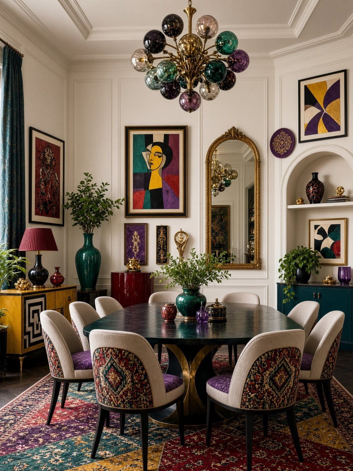
Eclectic dining room decor runs from a quart of paint and a free afternoon to a full wallpaper install and reupholstery at a few hundred per seat, and every idea on this list lands somewhere in that range.
The idea that fits your project depends on whether you rent or own, because that single fact eliminates the painted ceiling and anything that requires a drill before you start.
I would point to the brass hardware rule as the thread that holds these rooms together: repeat one material three times and even mismatched chairs and mixed eras read as intentional.
1. Art and Wall Decor
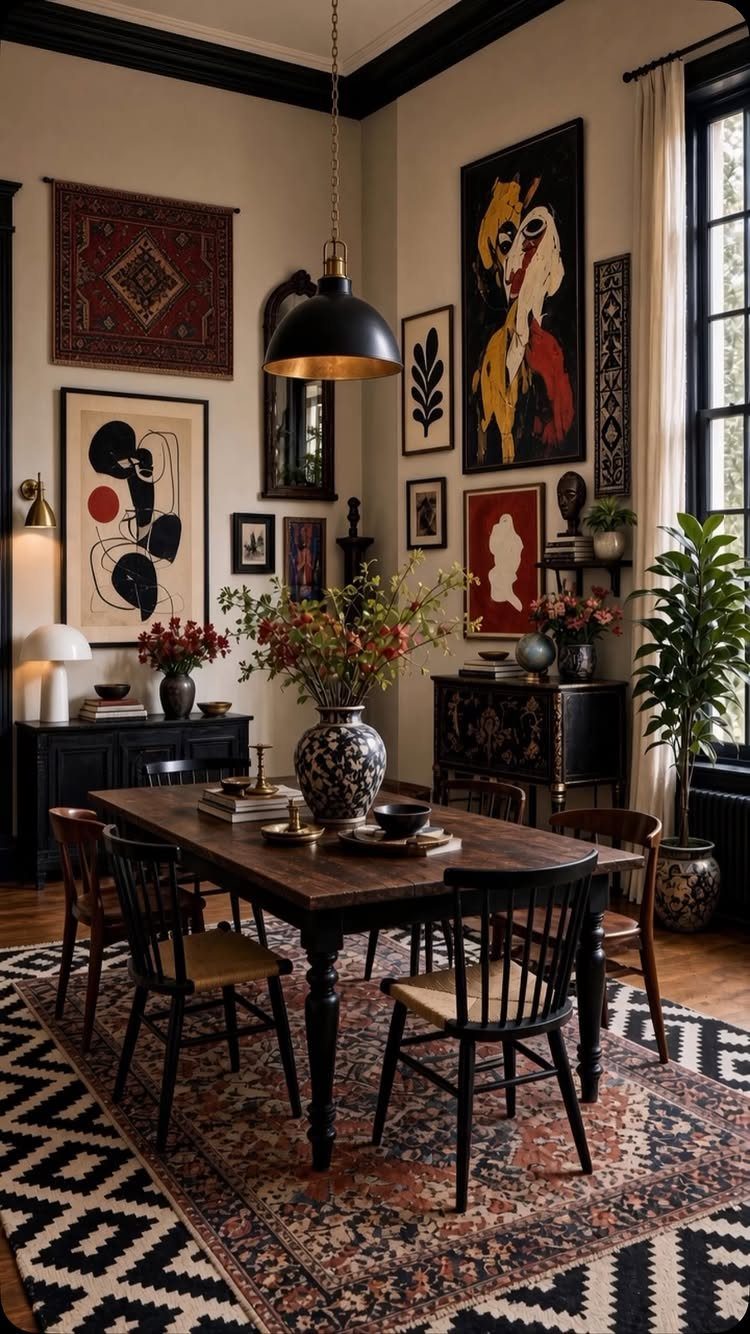
A gallery wall in a dining room works best when it looks assembled over years, not bought in a single afternoon.
I like to start with one piece I already own, then add frames in a mix of finishes that talk to each other without matching.
The hanging textile in this room is a move I would borrow: it breaks up the rectangles and adds weight where paint alone would feel thin.
For renters, Command strips rated for the actual frame weight save your deposit, though I would still use a nail for anything heavy enough to worry about.
The tradeoff with dense walls is that you need to edit. Every few months I rotate one piece out so the eye doesn’t glaze over.
2. Plants and Natural Materials
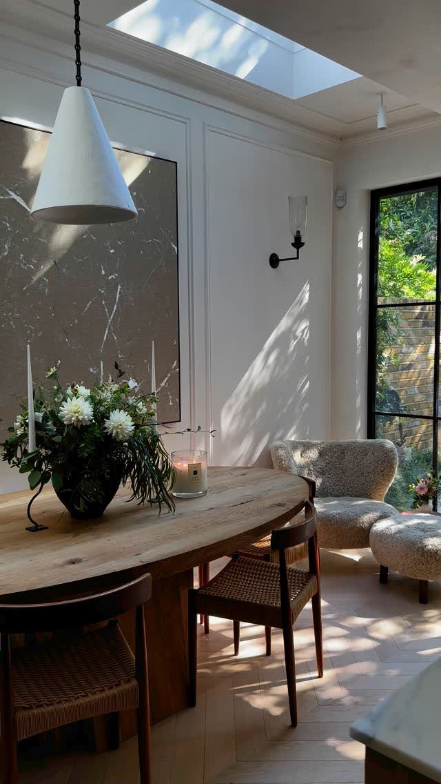
A single large bouquet on a wooden table does more than a dozen small plants scattered around.
The woven seats and herringbone floors already bring in organic texture, so the flowers read as part of a system rather than an afterthought.
I would check two things before buying: whether you will remember to change the water every day or two, and whether your table finish can handle water rings.
A thin glass mat or a low ceramic tray solves the second problem without killing the look.
3. Eclectic Dining Chairs
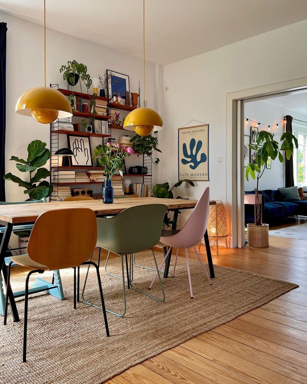
Mismatched chairs look intentional, not accidental, when you control one variable. In this room the shapes vary but the saturation level stays consistent, so nothing screams for attention alone.
I would pick either color family or silhouette to unify, never both. If you already own chairs that clash on both counts, painting 2 or 3 in one tone buys you cohesion for the cost of a quart of paint plus primer.
The one limit I watch is seat height: a small spread is invisible, but too much and someone eats at their chin.
4. Mix Vintage and New Pieces
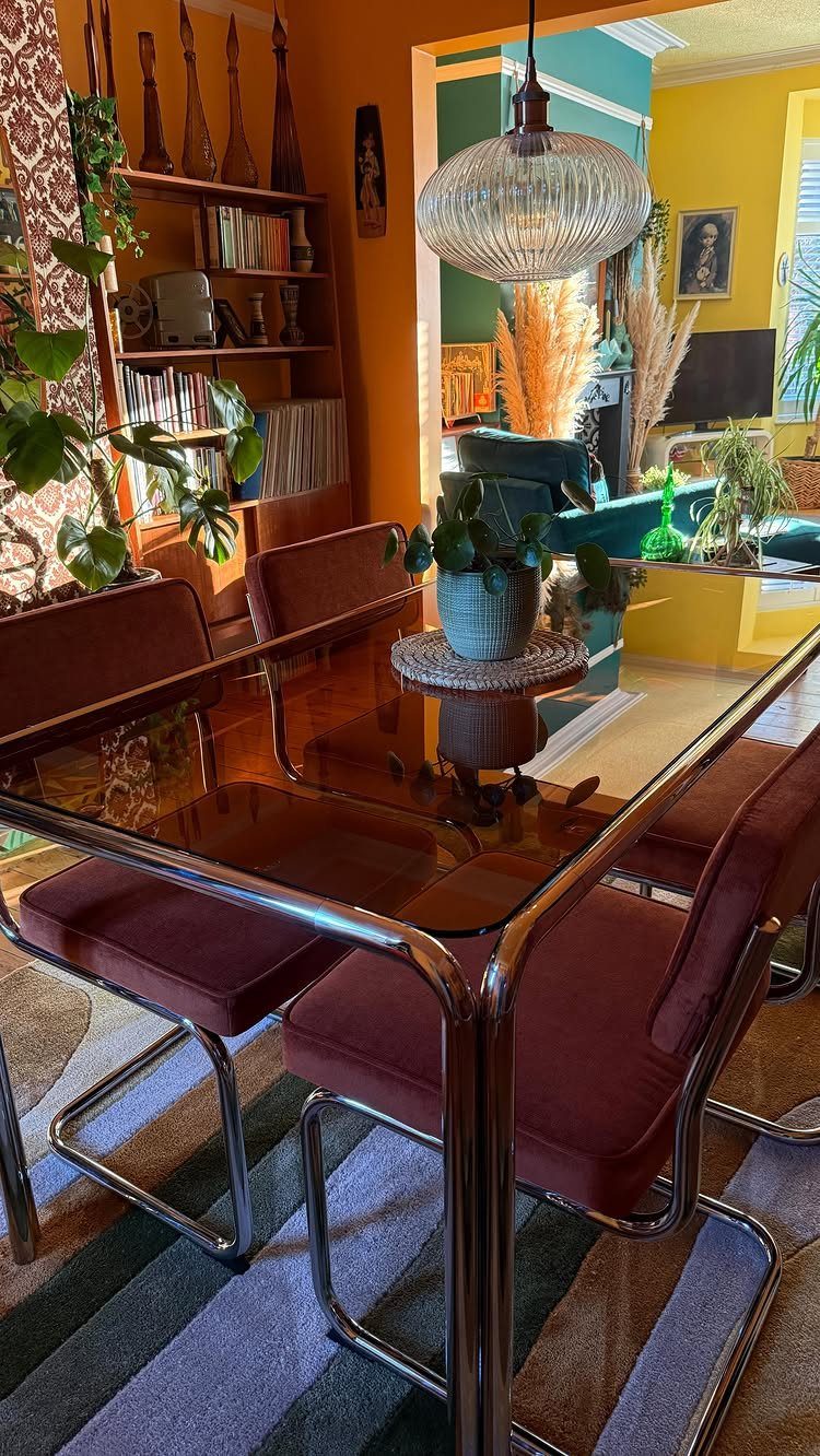
A chrome-and-glass table against velvet and stripes shouldn’t work, yet it does because the room commits to contrast everywhere.
I would not try this with one vintage piece and everything else from a single big-box store; the eye spots the plant.
What makes mixing eras readable is repeating materials across time periods, the chrome echoing in a lamp base, the velvet turning up on a pillow.
For first-home owners, vintage chairs with good frames and tired upholstery are the easiest entry point. Reupholstery runs a few hundred per seat depending on fabric, but a clean frame with solid joints is the part you cannot fake.
Eclectic style leans on a deliberate mix of vintage and new, unexpected pattern pairings, and one-of-a-kind finds, in a palette that’s bold and layered — the palette is built around a few colors that repeat across the room.
— Havenly
5. Bold Wall Colors
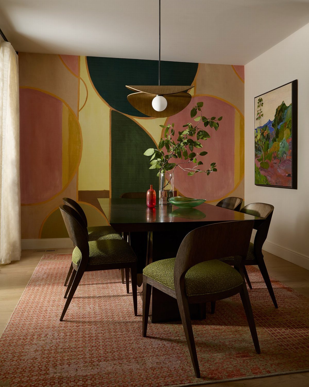
Painting shapes directly on the wall, rather than hanging art, means you live with the geometry until you repaint. I like this approach for renters who can paint back, or owners who have committed to a color already.
The green chairs and dark table ground the mural so it doesn’t float away as pure decoration. If you try this, test your shapes in chalk first and live with them long enough to see them in every light.
The scale that reads bold at night can feel oppressive by morning light. A quart of each color is usually enough for shapes this size; buy sample pots first.
6. Patterned Curtains and Statement Lighting
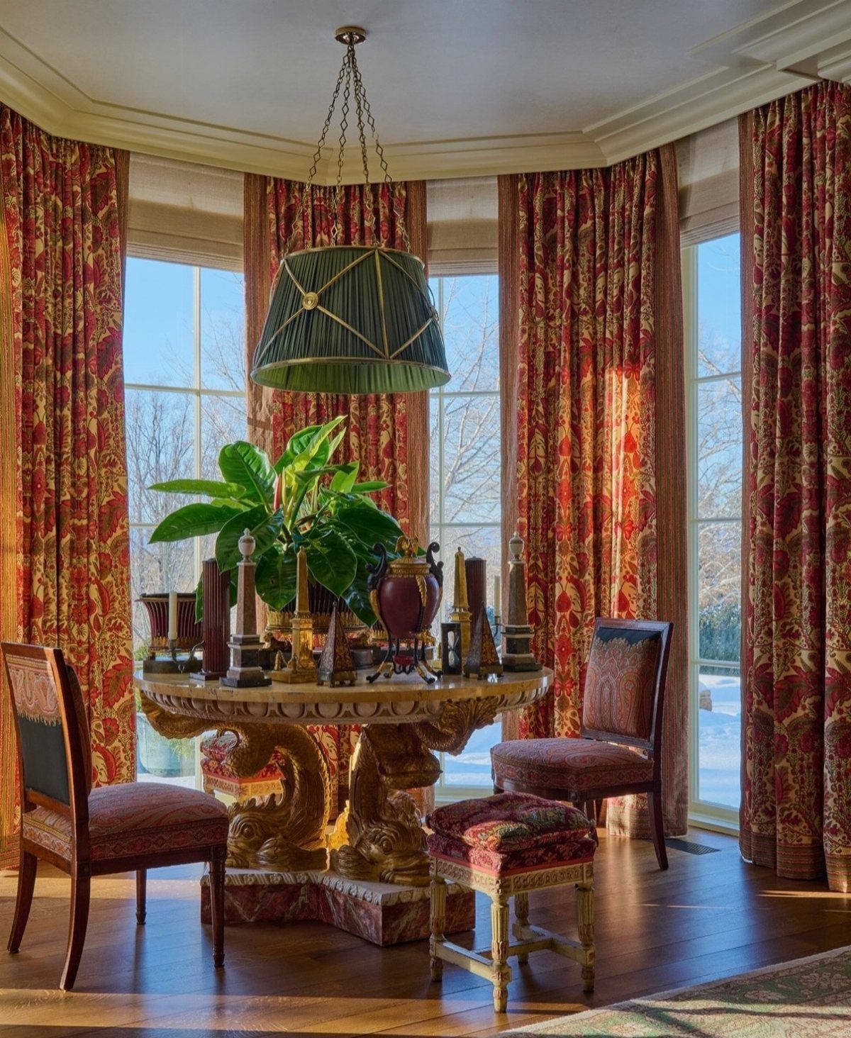
Red patterned drapes in a dining space work when the pattern contains at least one color already present in the room, so the eye travels rather than sticks.
The green pendant here does that job, picking up a tone from the curtain print.
I would hang rods well above the window frame and extend past the sides; the drapes stack clear of the glass and the room feels larger.
For renters, tension rods inside the frame are a false economy in a space this visible.
A proper rod mounted with toggle bolts costs less than a takeout dinner for 2 and leaves holes you can patch in under half an hour when you leave.
7. Printed Table Linens
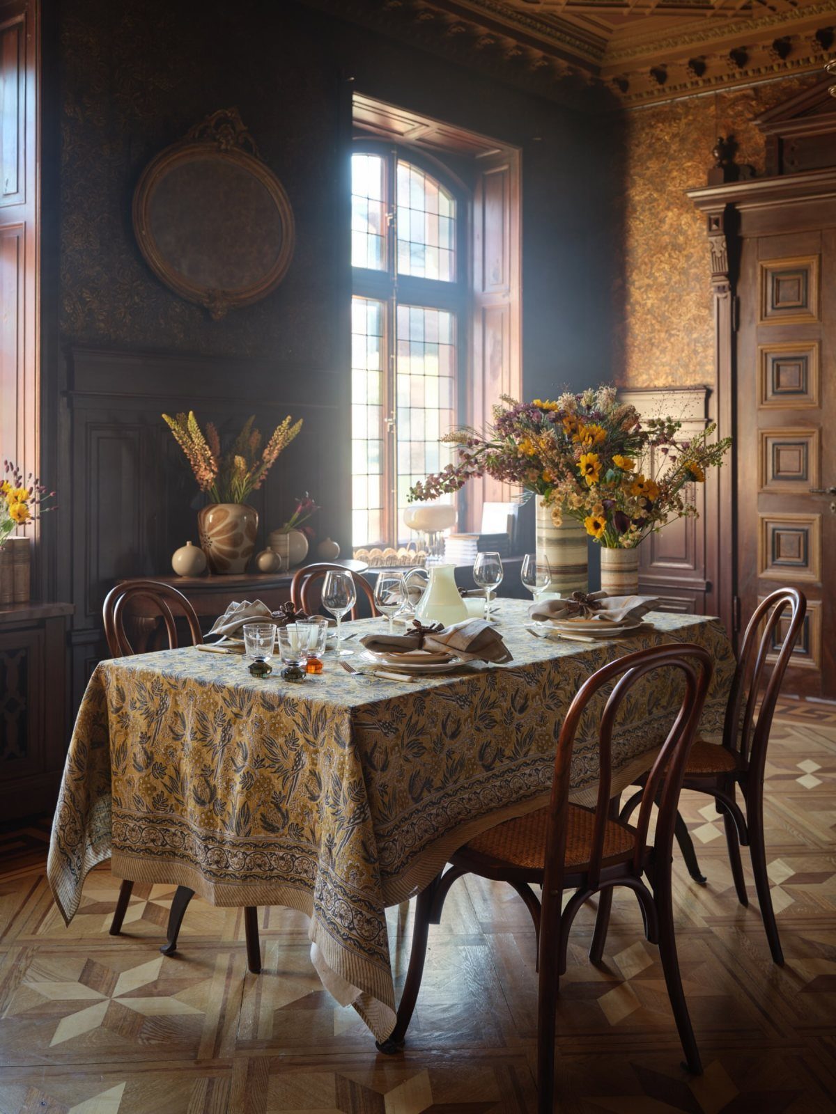
An ornate printed tablecloth turns a dark, paneled room approachable in about 10 minutes. I would choose cotton over polyester for a formal setting like this; it drapes properly and the print reads richer.
The risk is size: too small and the cloth looks like a napkin, too large and the overhang fights chair legs.
Measure your table with leaves in and out before ordering. For a room this heavy on wood, I like a print that pulls in blue or another cool tone to balance the warmth.
8. Whimsical Floral Wallpaper
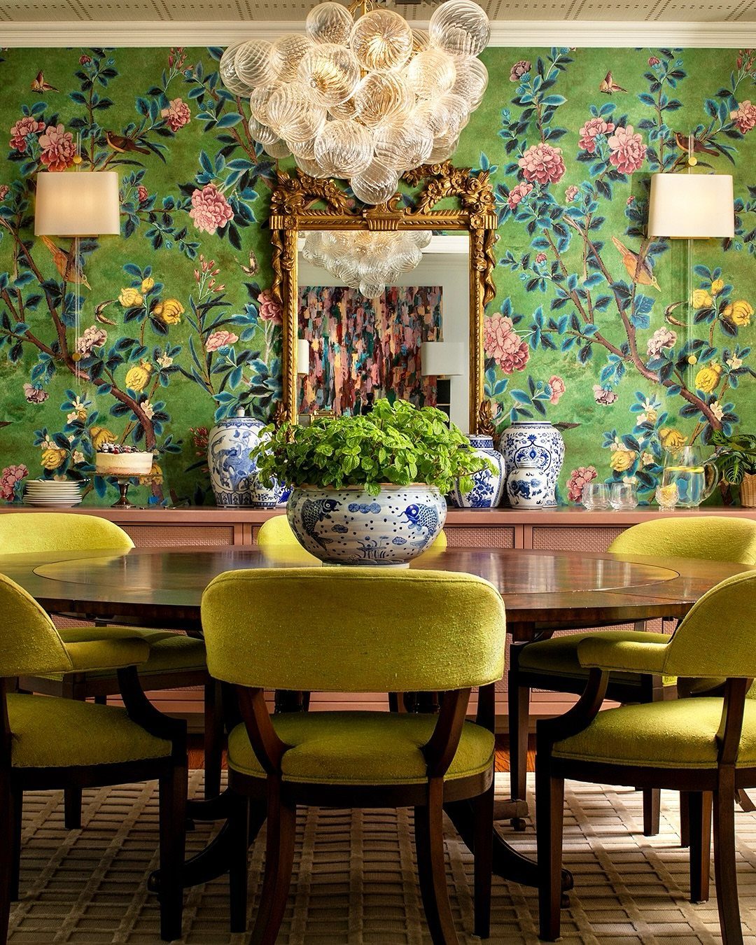
Botanical wallpaper with birds and flowers goes maximalist fast, so I watch what else competes.
Gold mirror behind chartreuse seating doubles down on the color instead of toning it down, and that is the choice that makes this room feel collected rather than decorated.
I would stop there and keep the table simple, maybe bare wood with no runner.
For renters, this is a commitment: peel-and-stick botanical prints exist, but the good ones cost nearly as much as paper and paste, and the cheap ones read like wrapping paper.
Test one panel behind the intended table for a week before you buy the rest.
9. Striped Ceiling Accent
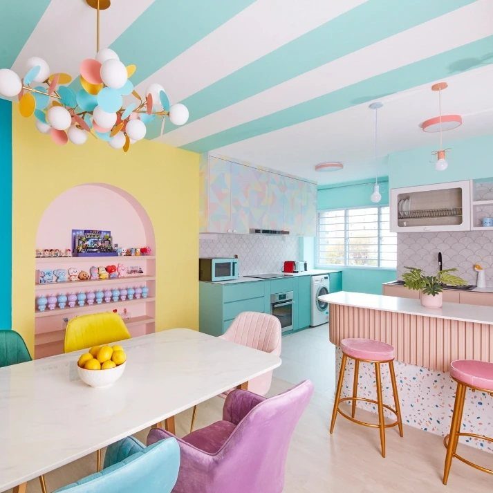
A striped ceiling draws the eye up and makes a low room feel taller, though I would not try it in a room that already feels tight; the stripes turn claustrophobic instead of playful.
Mint and white keeps it light, but the real work is taping. Spend the money on good painter’s tape and a laser level; hand-drawn lines wobble and the eye catches every one.
The arched yellow niche here gives the stripes something to talk to, so they don’t feel arbitrary. Without an architectural cue, I would add one strong vertical, a tall plant or a hanging light, to anchor the pattern.
10. Rustic Ceramic Hutch Display
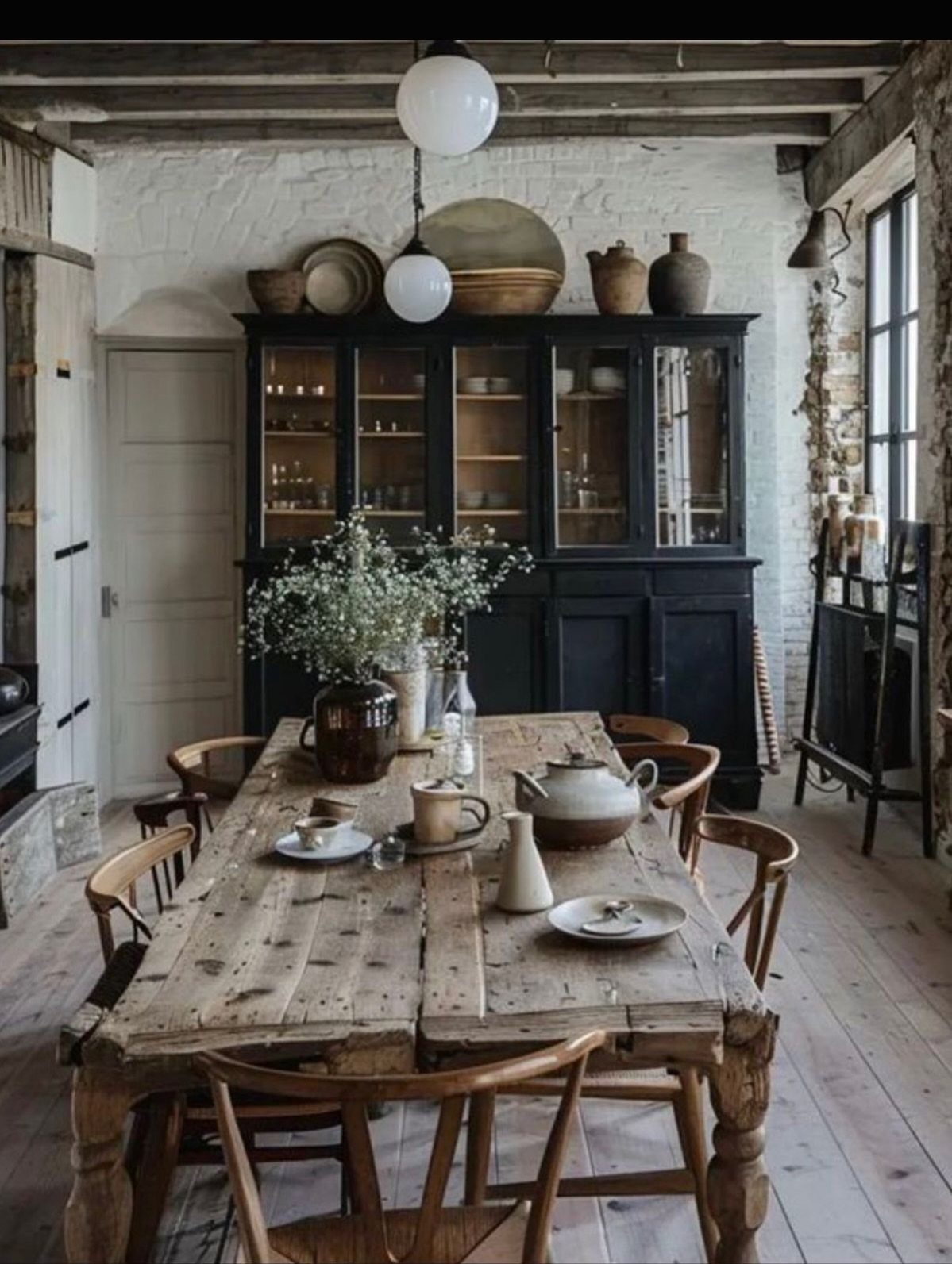
A black hutch against white brick lets the pottery inside do the color work.
I would arrange pieces in odd numbers, varying height but keeping some empty shelf so it doesn’t read as hoarded. The reclaimed table and simple chairs keep the focus on the display, which is the right hierarchy for a collector.
If you don’t own enough ceramics yet, build the collection slowly; a hutch half-filled with mismatched drugstore mugs looks like storage, not curation.
Thrift stores and estate sales are the obvious sources, but I also watch for restaurant supply closings, where serving ware often has more character than retail.
Creating a Cohesive Look
Eclectic rooms fall apart when every piece competes for attention. I would pick one thread, color or material, and repeat it at least three times so the eye recognizes a pattern.
Brass hardware on the hutch, a brass lamp base, brass nailheads on a chair: that is enough. Wood tones work the same way if you stay within two or three finishes rather than six.
The mistake I see is treating eclectic as permission to ignore relationships entirely. It is not.
It is the opposite: you choose the relationships deliberately, just from a wider pool. If your room already has 5 strong pieces and nothing connects them, I would add the bridge, not subtract the pieces.
A single color pulled through textiles, ceramics, and wall art costs almost nothing and solves the problem in an afternoon.
Choosing a Dominant Color
A single hue in two or three tones keeps an eclectic room from becoming noise.
I would start with blue or purple, which tend to read richer than red and hold more interest than yellow or green in most dining spaces.
The move is to choose your anchor, a chair or a wall, then let everything else vary in lightness and saturation while staying in the same family.
A textured wall in cool blue or a live-edge table against a purple backdrop gives you the variation eclectic style needs without the clash.
If you want contrast, I would bring it in through texture or shape, not a second hue. A sculptural 3D wall piece or a rough wood surface does that job without splitting your palette.
The rooms that fail at this usually have too many colors at full strength; the ones that work commit to one and explore its range.
Using Wallpaper
Wallpaper is the fastest way to add both color and pattern without replacing furniture.
I would use it when the rest of the room is relatively settled, a formal table set you already own, for instance, and you need the backdrop to do the heavy lifting.
Bold paper lets you keep the big pieces neutral, which is often the cheaper path.
Wall decals or custom work take this further if you want something no one else has, though I would budget more for installation or artistic labor there.
Textured papers, the kind that reads almost sculptural, add another layer that paint cannot match. The risk is commitment: unlike a painted wall, paper is harder to alter once it is up.
I would order a full panel sample and live with it for a week, seeing it at lunch light and dinner light, before you buy the roll count.
Frequently Asked Questions
What is eclectic design?
Eclectic design pulls from different eras and mixes patterns, finishes, and old with new, but the pieces have to actually talk to each other rather than compete for attention.
Color is the easiest thread to weave through, though material runs a close second; a matte black leg on the table and again on the light fixture gives the eye something to follow without shouting about it.
How to style an eclectic dining room?
Anchor the room with one older piece that has some weight to it, a sideboard or a set of chairs, then build around it with newer items that share one quality, a warm tone or a clean line, rather than matching period.
Comfortable seating that fits the space and lighting that sets the mood matter as much as the objects you choose.
What are some modern decor ideas for a dining room?
A single sculptural pendant over the table, a bench on one side instead of matching chairs, and a heavy linen or worn leather on the seats are what I would point to for modern dining rooms right now.
A sculptural pendant or a chrome lamp base adds material interest without cluttering the table.