The colors here run from quiet warm taupe and cream to saturated berry and decisive yellow, and the deciding factor is not taste but the light your kitchen actually gets.
1. Classic White
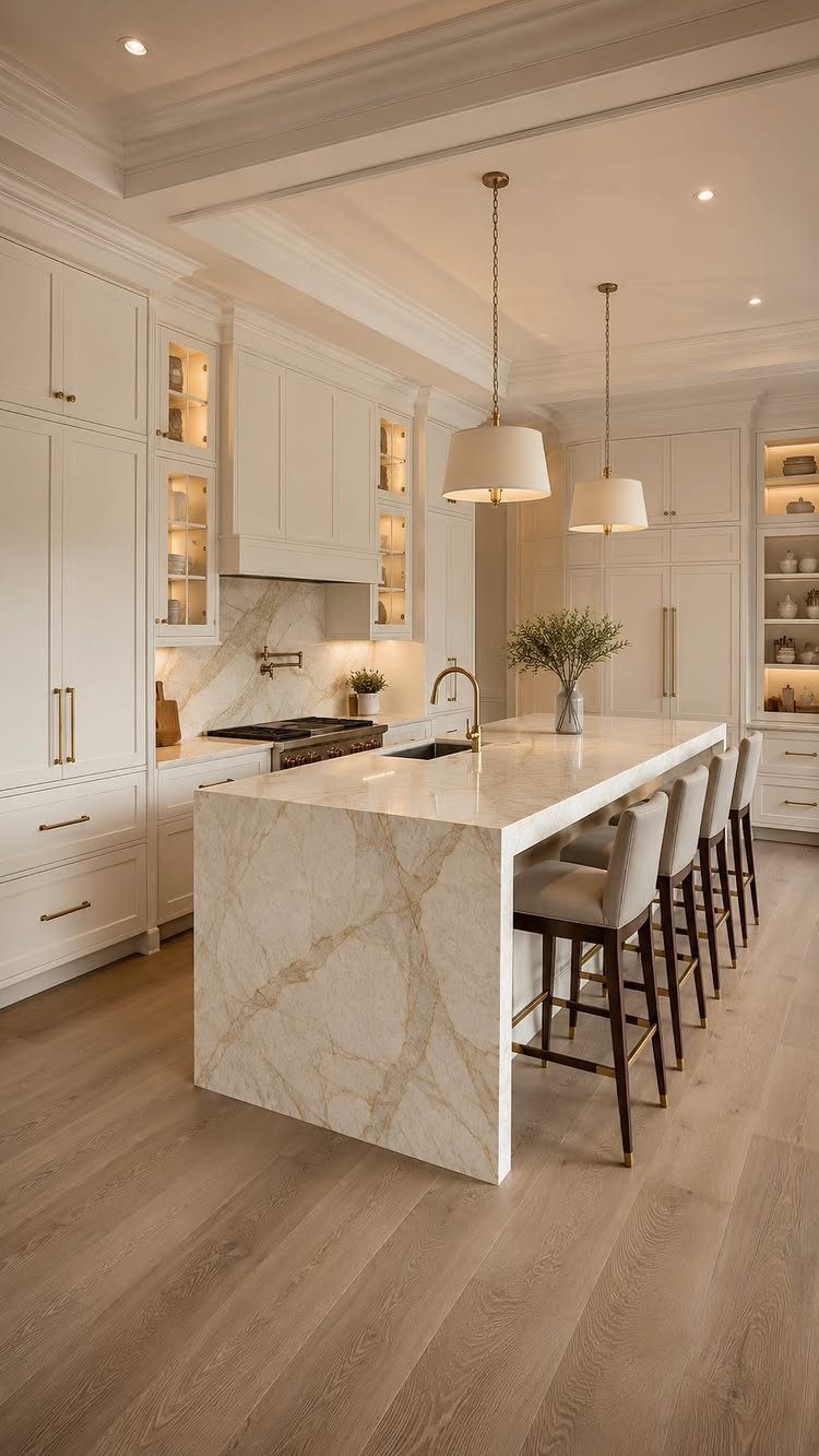
White cabinets stay readable in almost any light, which matters when your kitchen faces north or sits between taller buildings. I like them best when the finish has some warmth to it; stark white can read institutional against cool countertops.
Check your wall color before you commit. White cabinets amplify what sits next to them, and a too-yellow wall turns the whole room dated.
Light wood floors with white cabinets need contrast somewhere; I’d add it through hardware or a darker island base so the space doesn’t float away.
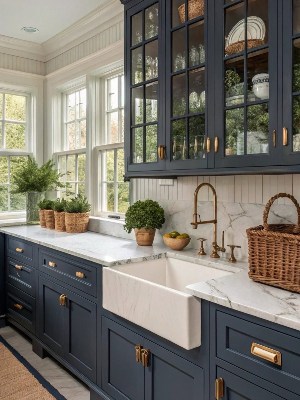
2. Navy Blue Cabinets with Brass Accents
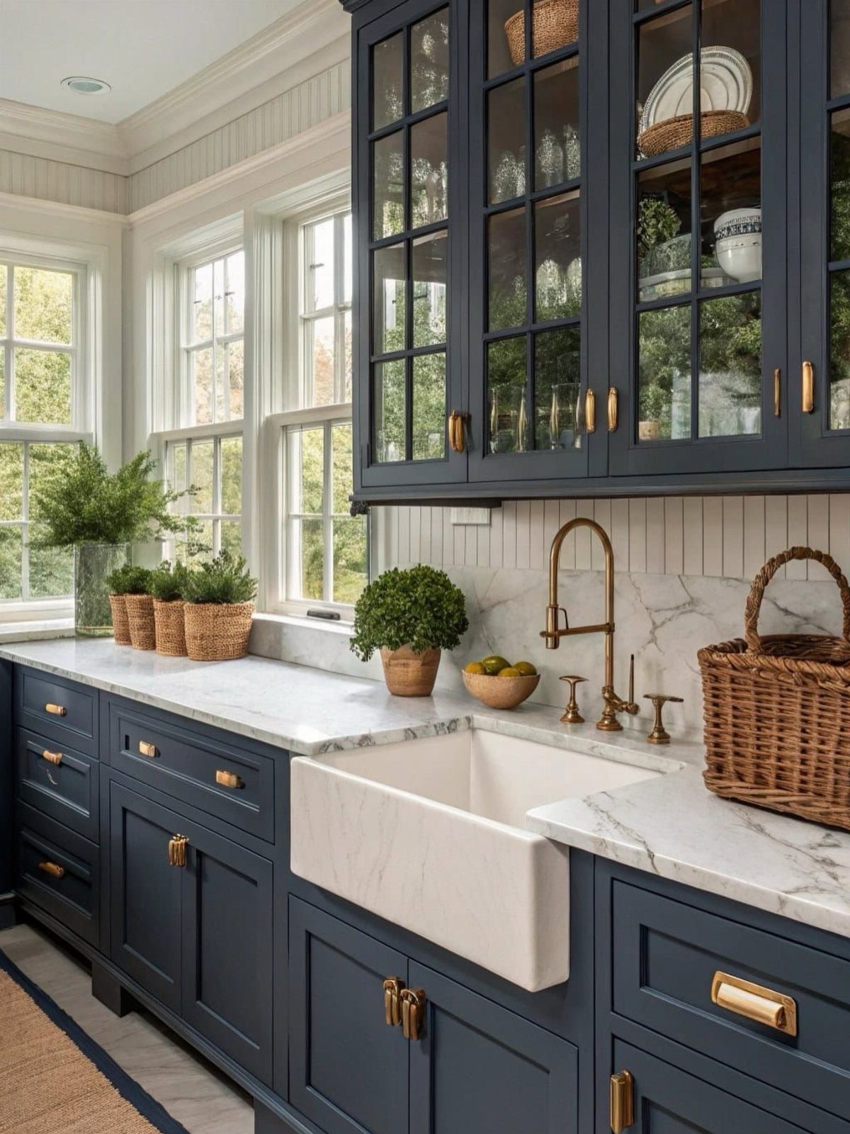
Brass against navy works because both carry weight; neither fights for attention. I would use this pairing in a kitchen that gets good daylight, since dark cabinets swallow artificial light after sunset.
Overly ornate brass pulls turn the look costume-y fast.
I usually specify unlacquered brass for clients who want the living finish; it tarnishes to a softer gold over time, which I prefer to the sealed kind that stays bright and eventually chips at the edges.
3. Gray
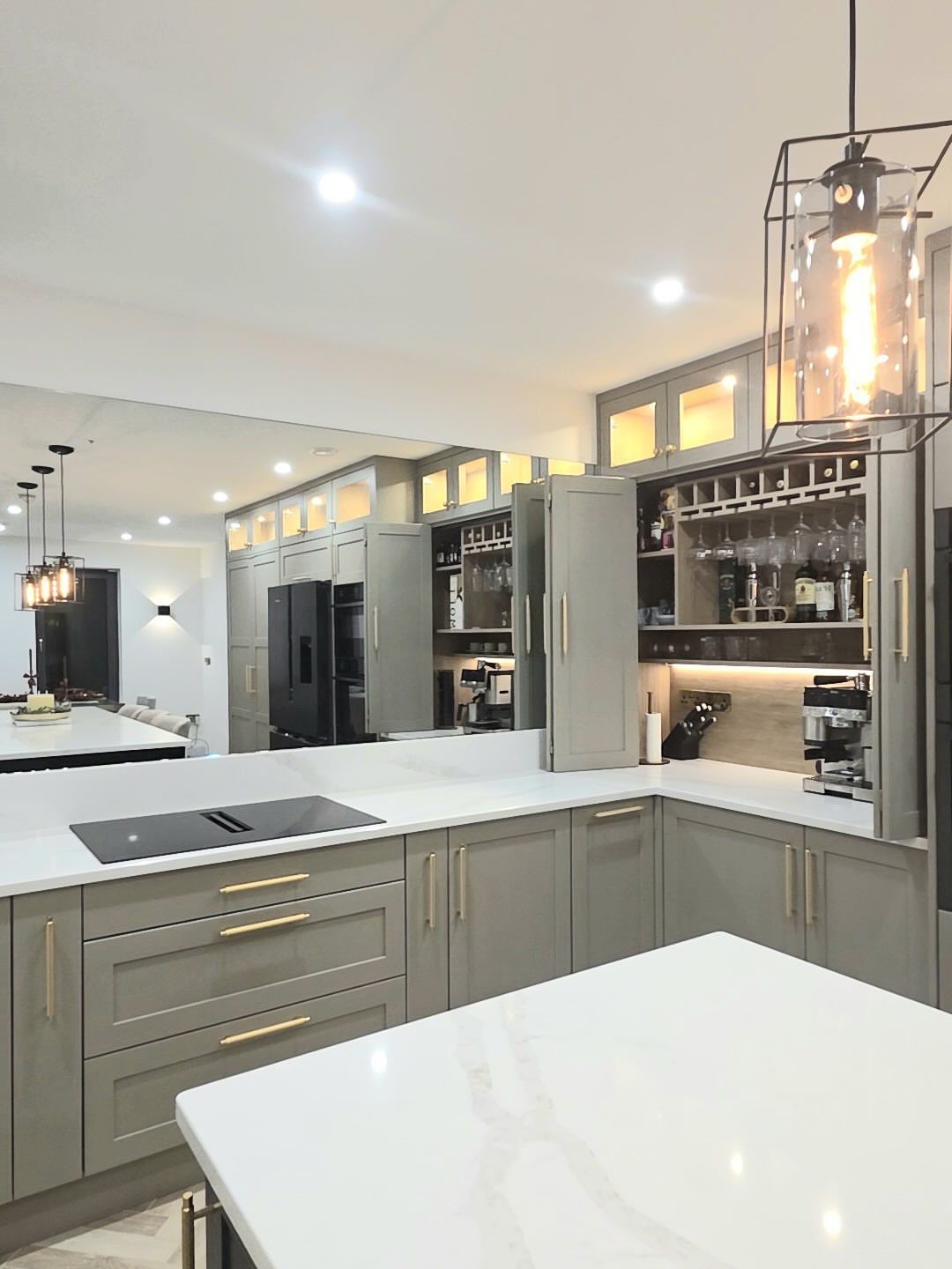
Warm gray hits a midpoint that reads intentional without demanding a theme. I reach for it when a client wants something quieter than navy but more grounded than white.
A mirror backsplash throws light around and keeps gray from feeling flat in a smaller galley. Without that move, I’d add texture somewhere else, maybe a honed rather than polished countertop.
Gold hardware warms gray up, but I skip it if the adjacent rooms already have silver fixtures. Consistency across sightlines matters more than matching metals within the kitchen.
4. Black
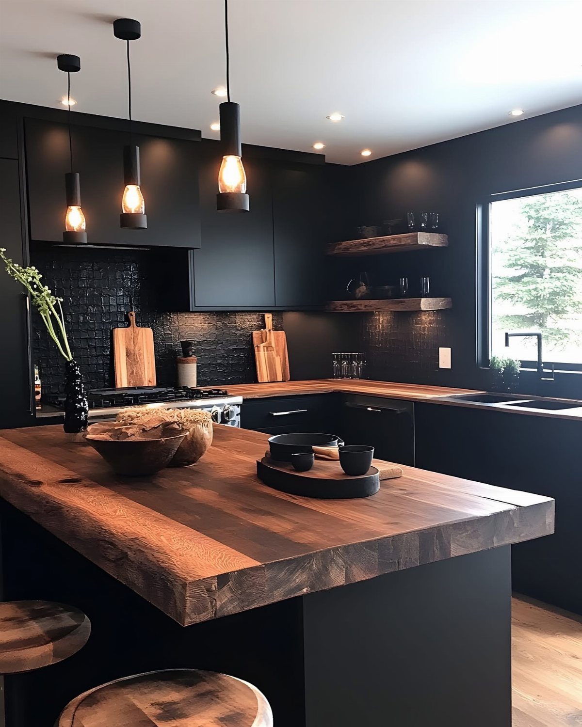
Matte black needs material thickness to succeed. Thin laminate reads as a film; these cabinets carry visual weight because the faces are substantial and the butcher block tops add even more.
I would not use black in a small kitchen unless most of it sits on one wall only.
Pendant lights in a matching finish are a smart echo, but I’d stop there. Black backsplash plus black cabinets plus black fixtures turns into a cave.
Wood stools and countertops are not decorative with black cabinets; they’re necessary relief. Keep at least one large surface lighter or warmer.
5. Muted Sage Kitchen Cabinets
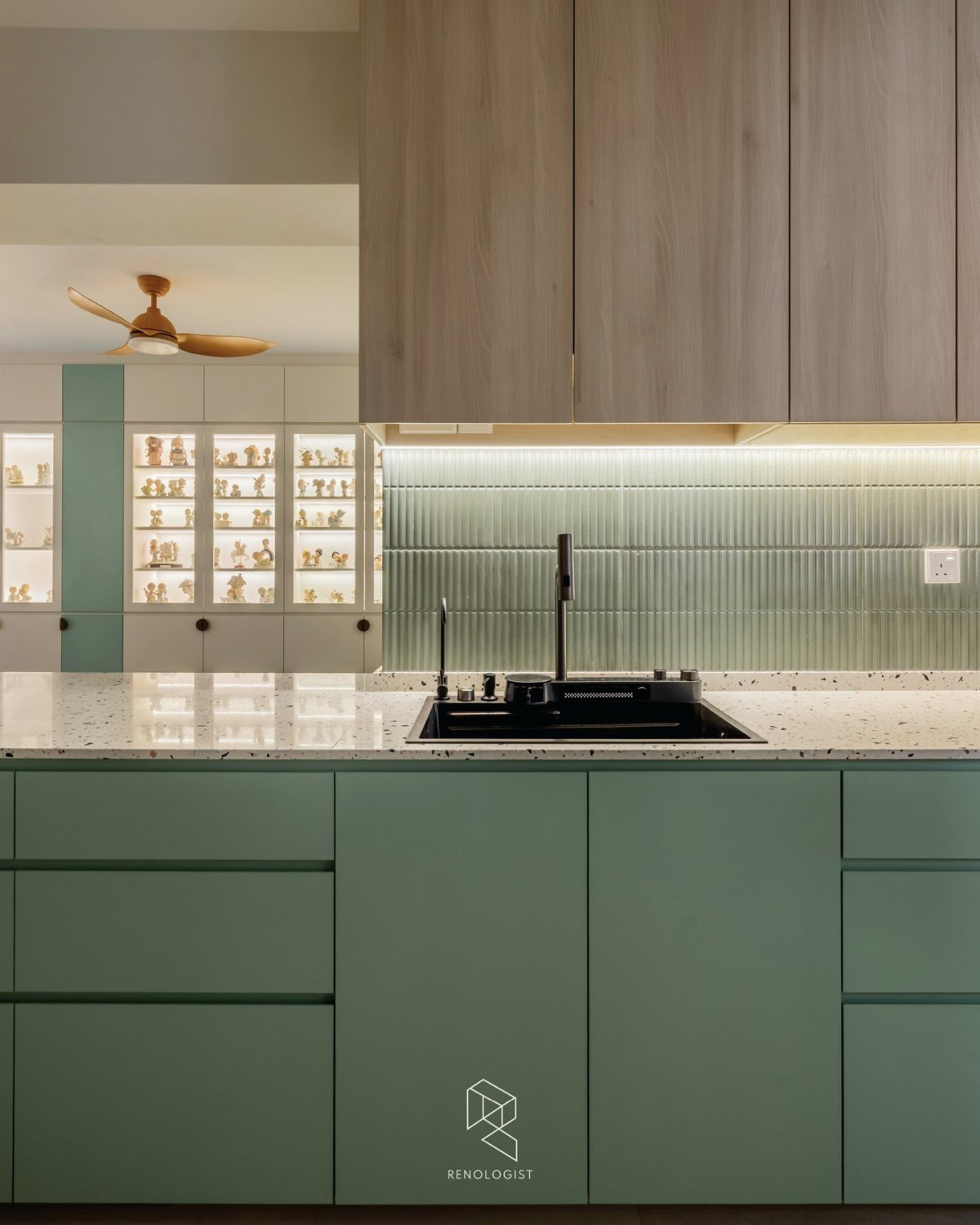
Sage green works with wood in a way that brighter greens do not.
I would check the undertone against your floor.
Sage with too much yellow turns olive; too much blue turns institutional. The fluted tile here is a detail I’d borrow directly, since the vertical lines draw the eye up without adding color competition.
If your sink is not integrated into the countertop, a white apron-front is the safer substitute; black porcelain shows water spots immediately.
6. Greige
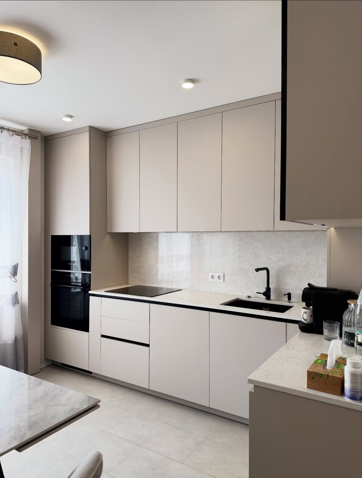
Greige succeeds where beige turns muddy and gray turns cold. Handleless cabinets push greige modern; add pulls and the same color reads transitional.
I like greige with black fixtures because the contrast stays soft.
The marble-patterned backsplash and table here share a tone rather than matching exactly, which keeps the room from feeling like a set. One caution: in a kitchen with warm afternoon sun, greige can shift unexpectedly yellow.
I always test a large sample panel and live with it for a day before ordering. The cost of a sample quart beats a cabinet repaint.
7. Forest Green Cabinets with Bronze Hardware
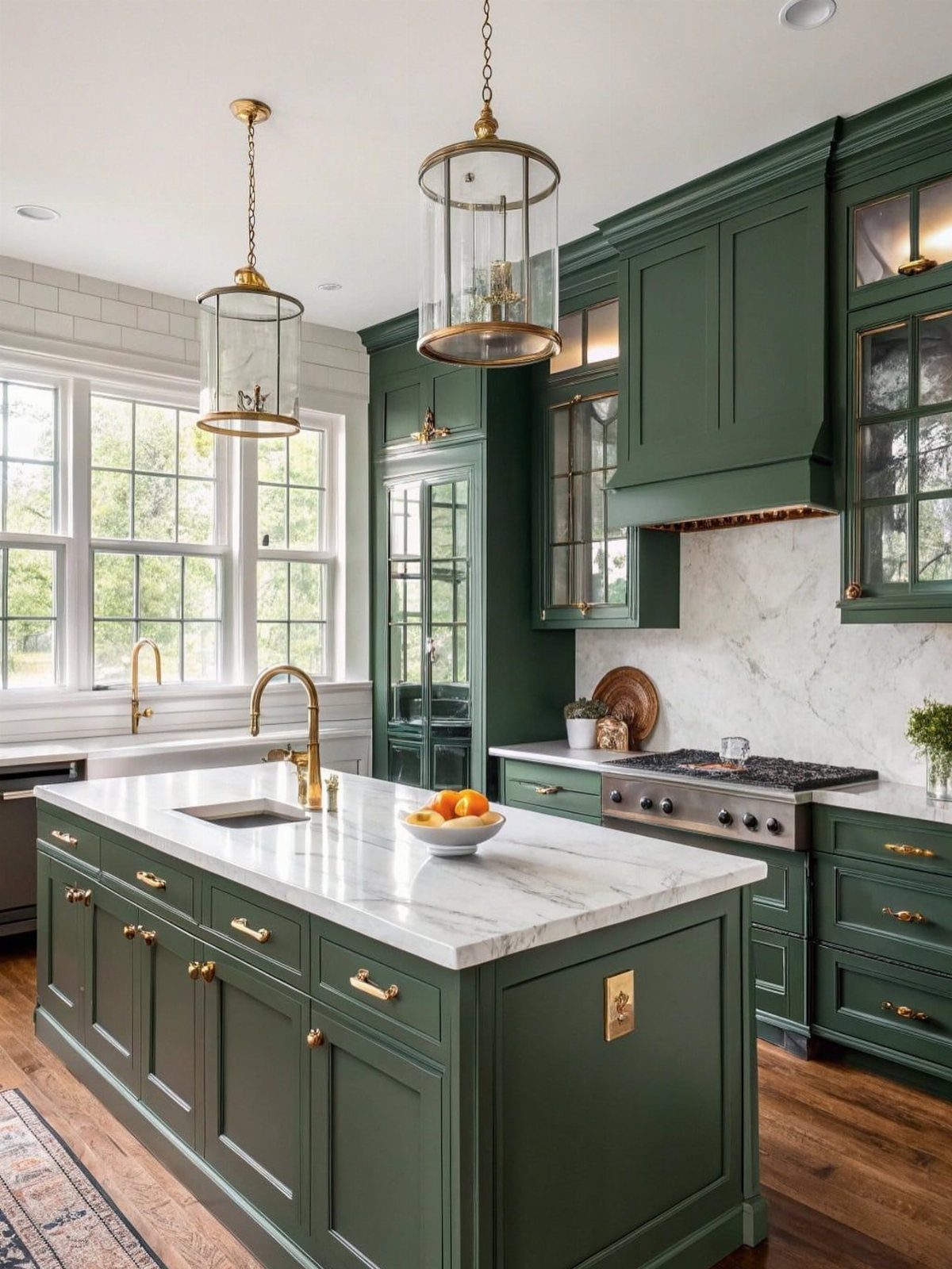
Forest green reads richer than sage without the theater of black. I would use it only where the kitchen gets real daylight; in a dim room the color collapses to near-black by evening.
Bronze hardware suits this green better than brass, which can turn competitive. Marble countertops bounce light up into cabinet faces, which keeps forest green from turning cave-dark.
Without that, I’d add under-cabinet lighting before I installed the hardware. Test your green against the marble’s veining; a sample door held at counter height tells you whether the pairing harmonizes or fights.
8. Berry Colors
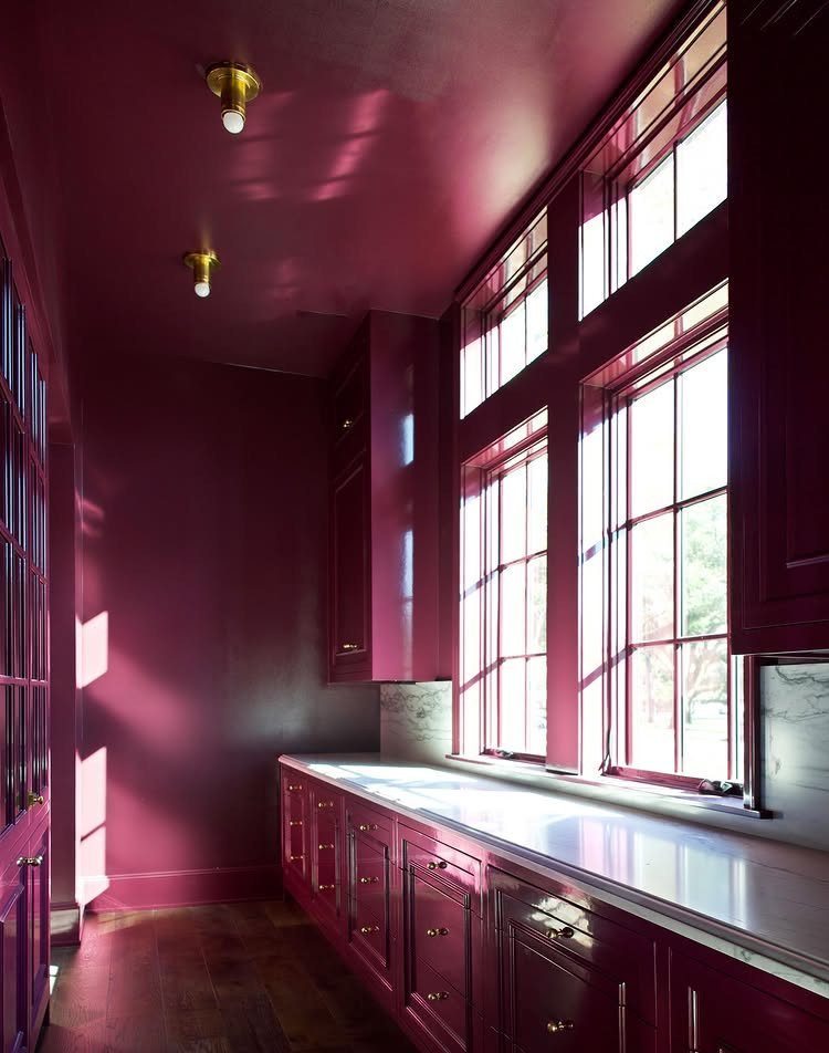
Berry is a commitment, not an accent. Walls, ceiling, and cabinets in the same deep berry tone work because marble counters and brass hardware read as deliberate interruptions.
I would not try this in a kitchen that opens directly into a living area unless you want the kitchen to dominate the sightline. The gloss on these lower cabinets matters; matte berry turns flat and heavy.
Large windows are doing the heavy lifting here. In a darker room, I’d keep berry to an island or pantry only, and run white or pale wood everywhere else.
9. Brilliant Red
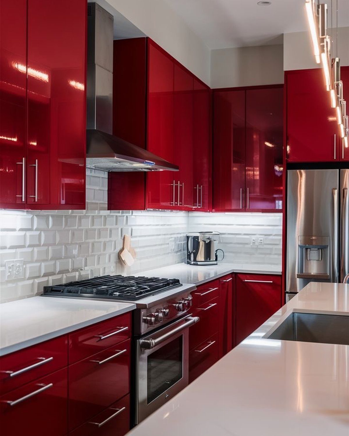
High-gloss red is the most demanding color on this list. It shows every fingerprint, every grease particle, every misaligned door gap.
The white quartz and subway tile here are not decorative choices; they’re survival tactics. Red needs neutral surroundings or it becomes a diner booth.
I would specify a true white, not cream, for the adjacent surfaces. Anything warm turns the combination ketchup-and-mayo.
Stainless steel appliances are the safe default; black would add another heavy element I’d rather not manage. This suits someone who cleans as they cook, not the weekend project type.
10. Light Oak Kitchen Cabinets
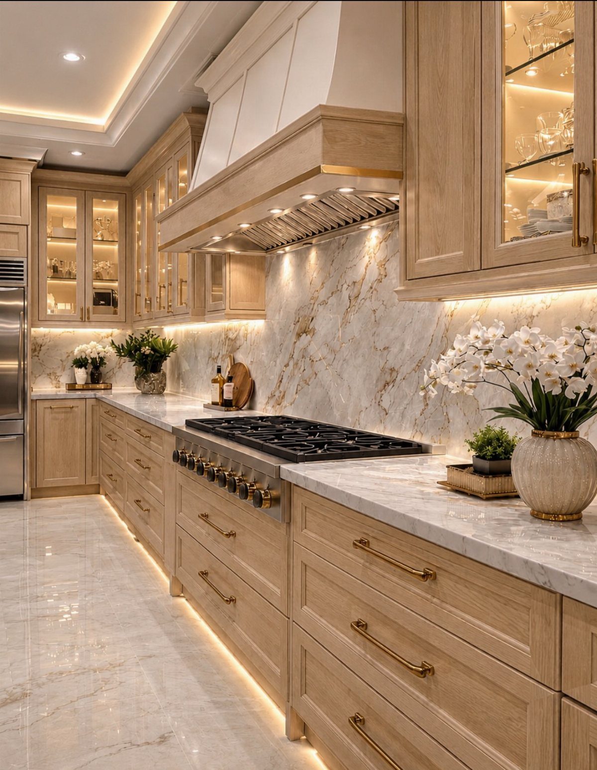
Light oak has come back, but the new versions read cleaner than the heavy golden finishes that dominated 3 decades ago. Marble countertops and backsplash move light oak from rental-grade to intentional; without stone, the look turns Scandinavian cafeteria.
Under-cabinet lighting is not optional with oak. The grain catches shadows and looks cheap in dim spots.
I’d keep hardware minimal; the wood is already doing the visual work. Gold hardware works with light oak, but I’d avoid anything too yellow.
Aged brass or matte black keeps the tone current. This is one of the few finishes where I prefer slab or flat-panel doors; shaker detail plus oak grain gets busy fast.
11. Cream Kitchen Cabinets
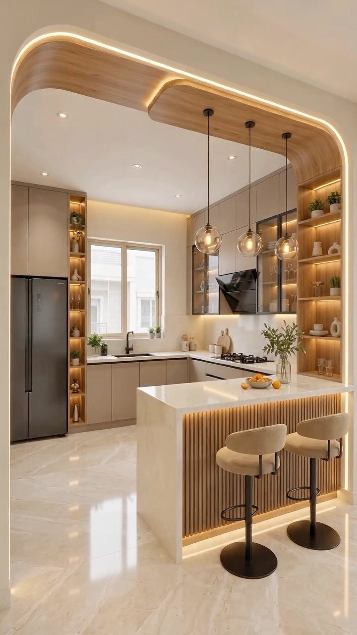
Cream flat-panel cabinets carry a warmth that white cannot, but they need architectural context to avoid reading as builder-grade beige.
The ribbed wood island detail and built-in shelving here supply that context.
I would not install cream cabinets in a kitchen with standard low ceilings and no other wood elements; the room turns featureless. LED lighting at 2700K or below is essential.
Anything cooler and cream shifts to dirty yellow. An archway does spatial work in a cream kitchen; in a plain rectangular room, I’d add vertical interest through open shelving or a taller backsplash.
12. Two-Tone Cabinets
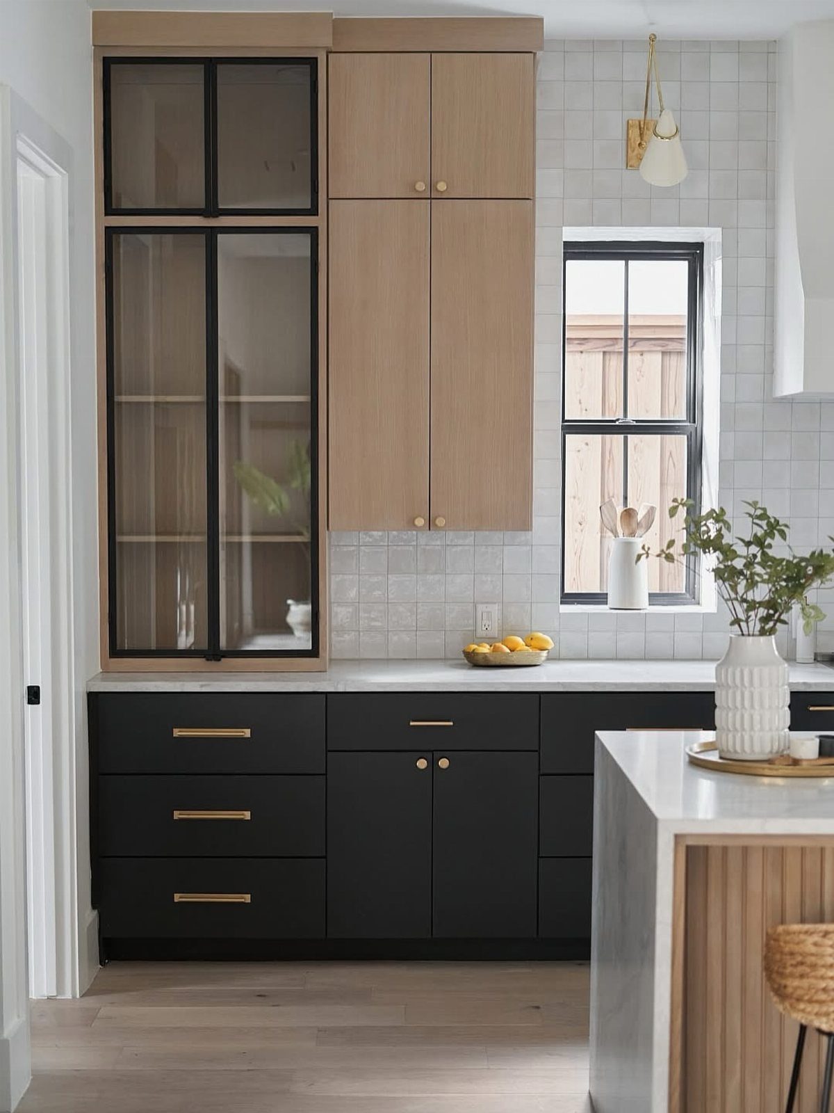
Two-tone works when the division has logic. Black below and light wood above follows the floor-to-ceiling gradient that feels grounded; reversing it can look top-heavy.
The glass-front uppers here are a detail I’d borrow selectively. They break the solid mass and let you display a few items, but I’d limit them to one run.
Every glass door is a commitment to interior order. Brass hardware bridges the 2 tones because it reads warm against both.
One caution: the white tile backsplash is the neutral territory that lets the cabinets negotiate. Without a pale backsplash, the 2 colors clash at the meeting line.
13. Warm Taupe
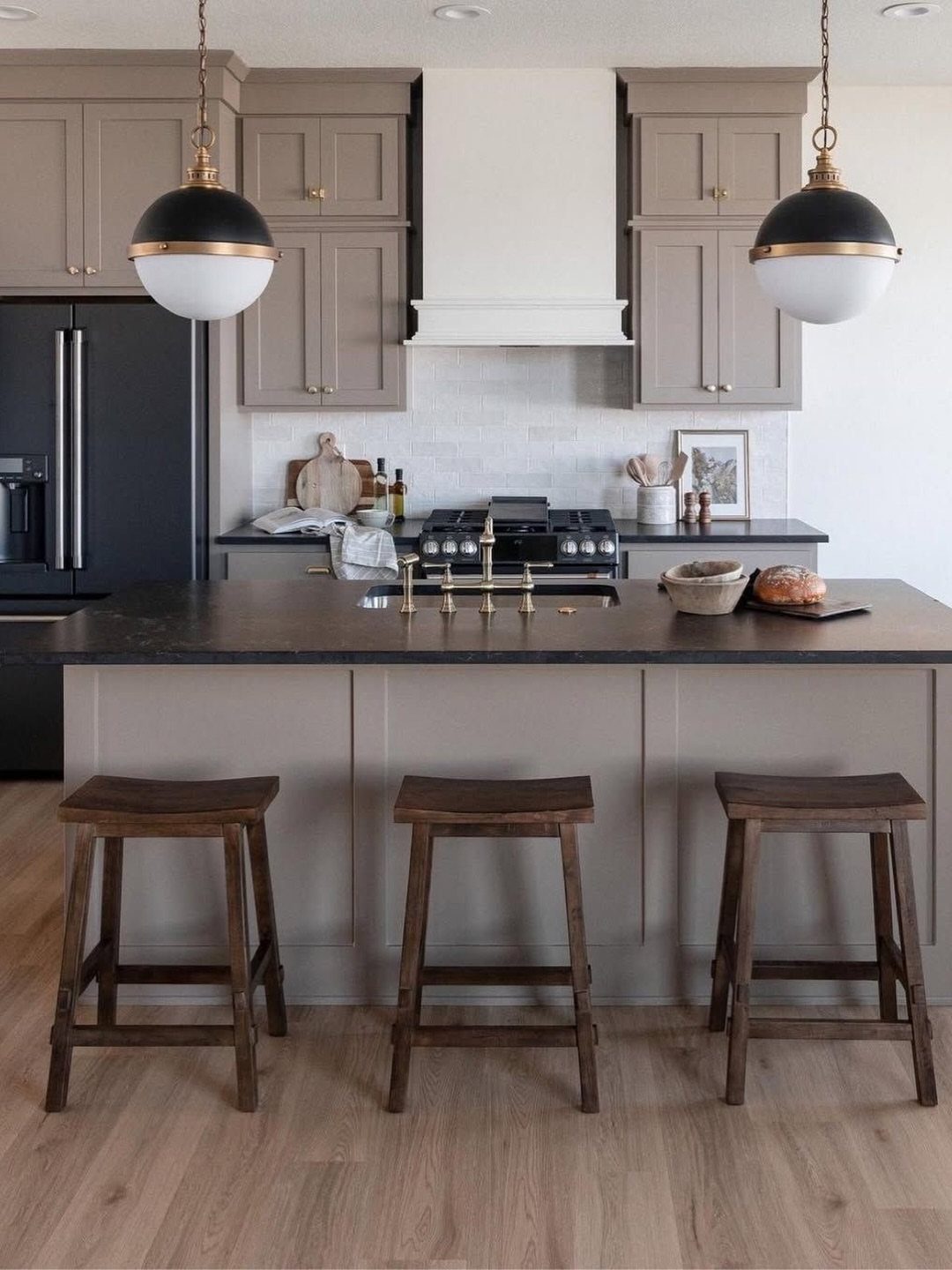
Warm taupe settles between gray and brown without committing to either. I like it for kitchens that open into living spaces where a stronger color would fight the furniture.
The dark island here is doing necessary work; taupe cabinets on taupe walls need that depth or the room turns to vapor.
The black and gold pendants carry weight that taupe alone cannot supply. I would test this color at dusk, when its gray side comes forward and can read cooler than you expect.
The light wood flooring keeps it from feeling like a basement rental; if your floors are dark, add relief through a lighter countertop instead.
14. Mint Green Cabinets with Natural Wood
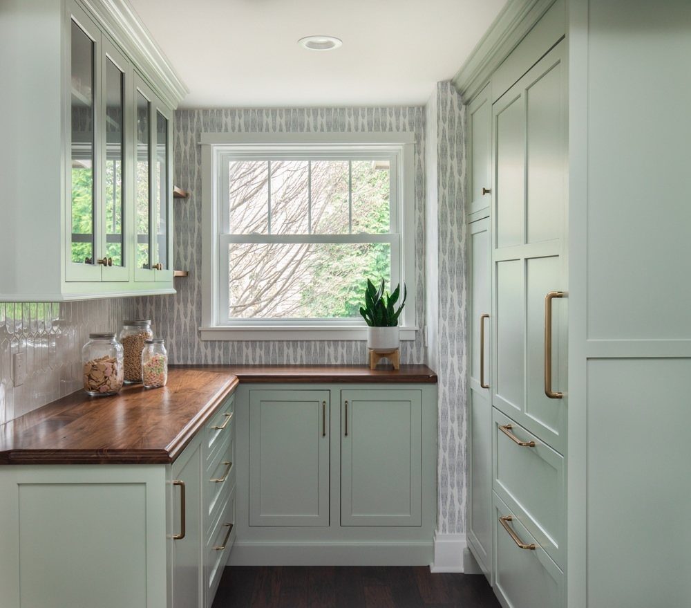
Mint green with natural wood reads fresh without the sweetness of a nursery. Brass hardware is the right warmth against mint green and natural wood; nickel or chrome would turn the whole thing clinical.
A patterned wall behind the sink gives the eye somewhere to rest besides the cabinets, which matters in a narrow space where mint could dominate every glance.
The wood countertops need oiling twice a year to stay presentable; that is a maintenance trade I would accept for the warmth they add.
Glass jar storage fits the pantry logic but skip it if this is your main kitchen; open storage accumulates grease near a cooktop.
15. Decisive Yellow
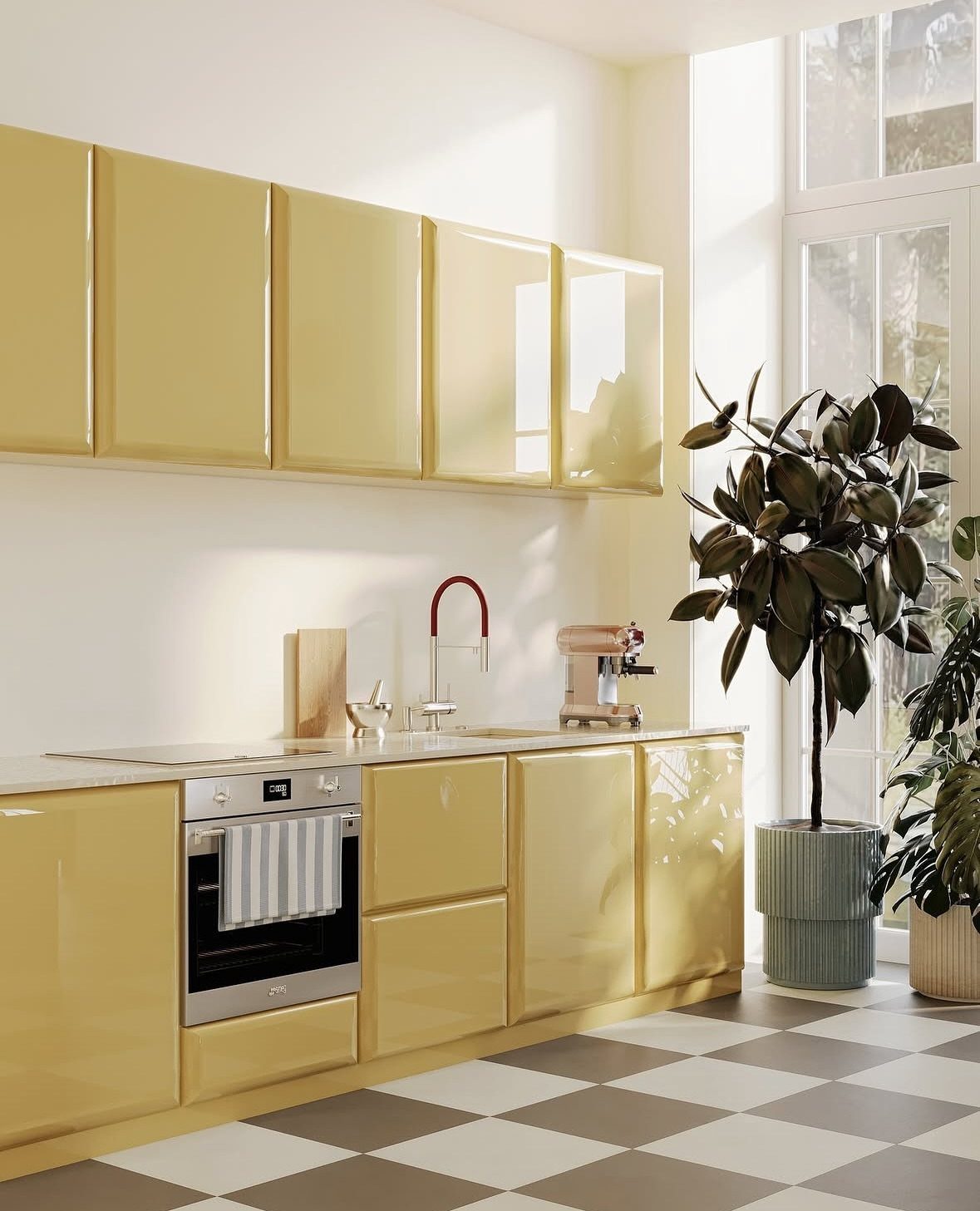
Yellow this saturated demands commitment and a room that can handle the noise. The high-gloss finish here doubles the light but also doubles every imperfection; matte yellow is easier to live with and harder to find.
Checkered floors echo the retro diner mood whether you want them to or not.
I would keep them only if the rest of the house already plays with pattern; otherwise, a warm wood or neutral stone grounds the cabinets without adding another voice.
The tall windows are doing real work here. In a kitchen with average light, I’d keep yellow to upper cabinets or a single bank, never a full room.
Consider Lighting and Mood
Light does more than show color; it changes it.
A north-facing kitchen or one tucked between taller buildings turns even warm whites cool by afternoon, which is why I check cabinet samples under morning, midday, and evening light before ordering. Artificial light matters as much as sun.
A galley kitchen with one window needs layers: under-cabinet strips, pendants over work zones, and maybe LED inside glass uppers. Without them, dark cabinets go flat after sunset.
Small kitchens gain breathing room from light colors or a glossy finish that bounces what light exists.
Large open plans can carry navy or charcoal because the surrounding space absorbs the weight. Greige, sage, and walnut need real daylight to read as intended; in dim conditions they sink toward gray or near-black.
Maintenance Considerations
Dark matte finishes are honest about fingerprints. Black and navy cabinets show every smudge from cooking oil or hand lotion, which means daily wiping or living with a lived-in surface.
I steer clients toward textured laminates or woodgrain veneers when they want a dark color without the policing. The texture breaks up light and hides the small scratches that accumulate near handles and drawer pulls.
Painted finishes chip at edges and corners, especially on lower cabinets where kicks and vacuum bumps happen.
Paint repairs with a small brush and matched color; a damaged laminate veneer usually means replacing the whole door. For rentals or households with kids, I weigh that differently than for a kitchen that sees light use.
Complementary Color Schemes
A kitchen does not stand alone. Sightlines from the living room or hallway mean cabinet colors negotiate with whatever sits adjacent, and a color that works in isolation can turn jarring when viewed from a nearby sofa.
I think of the kitchen as one instrument in a larger arrangement: one or two core tones carry the melody, with smaller accents providing the variation.
Beige and cream palettes suit traditional or rustic houses where warmth flows room to room. The risk is flatness; without contrast in texture or a darker anchor somewhere, cream cabinets on cream walls read as unfinished rather than intentional.
A darker island base, black fixtures, or warm wood flooring supplies that weight. Where the house already runs cool with grays and blues, I would not force warmth into the kitchen alone; the dissonance travels every time you walk through.
Gone are the days of solely relying on all-white kitchens or natural wood cabinetry for kitchen color ideas.
Frequently Asked Questions
What color cabinets are in style?
Blue leads right now, with navy and deep tones showing up in more kitchens than I’ve seen in years. White still holds strong because it stays readable in any light, and gray has climbed back as a quieter middle ground.
The shift I’m watching is toward color that carries weight, not just accent, with forest green and berry tones moving from statement pieces to full-room choices.
What are some simple color combinations for a kitchen?
Two-tone pairings with clear logic work best: black lower cabinets with light wood above follows the floor-to-ceiling gradient and feels grounded.
White with navy is straightforward because the contrast is sharp without fighting. The rule I follow is that one element should bridge both tones, usually hardware in brass or matte black.
What color not to paint kitchen cabinets?
I would not use black or navy in a small kitchen unless most of it sits on one wall only; dark colors swallow space and artificial light after sunset.
Berry or saturated yellow as a full room color needs large windows and an open plan that can absorb the noise, otherwise the kitchen dominates every sightline.
Stark white against cool countertops turns institutional, and cream without architectural context reads builder-grade beige.